Tuesday, August 30, 2005

Vengeance at Cackling Mountain by Shawn Cheng

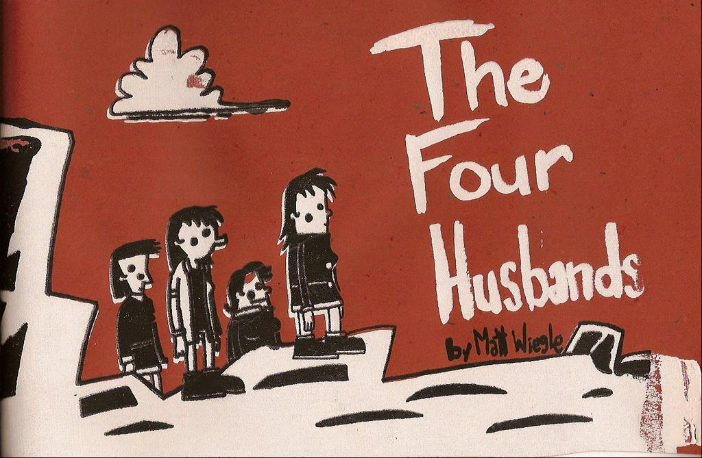
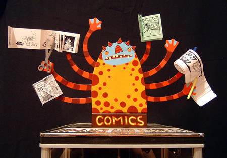
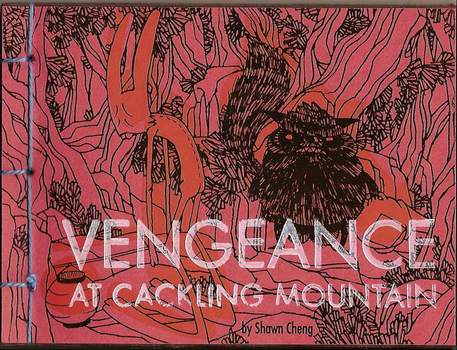
Shawn Cheng, the artist that brought us the irresistible and devilish Bogies mini-comic a year ago, has two new minis including the revenge romp Vengeance at Cackling Mountain. Vengeance is a 48 page fight scene shrouded in darkness, as the only illumination on these pages comes from the glow of a lamp or the occasional burst of flame. The pages are black, but Cheng uses three silkscreened colors throughout, giving each page a unique handcrafted look. I’ve prattled on about the handcrafted aspect of mini-comics many times, I know. But, it bears repeating. Often these books are as much art as comics. You can see the artist’s hand in the finished product. The line art in Vengeance was xeroxed, but each page has also been silkscreened. In other words, a lot of work went into these 48 pages. You can almost picture a flurry of pages hanging around in a basement or spare room as they dry. This book also has a binding with hand-stitched blue yarn.

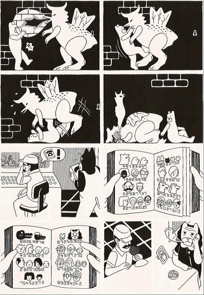
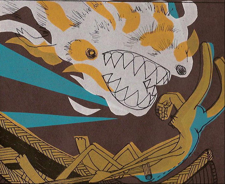
Vengeance is a silent tale, but there is a story in these wordless pages. A lanky, naked fellow is walking around in the forest when he’s waylaid by this very sinister looking beast. This beast has been drinking and he’s carrying a detached human arm. The arm is what he uses to hit the naked guy, and it becomes stuck in the poor guy’s face. This panel is an explosion of yellow, white and burnt orange as the pain radiates from the poor guy’s face. Just pages later though, he casually touches the beast’s back and a flame appears.

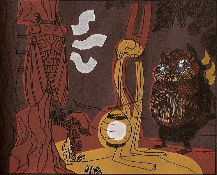
Using the black paper for this mini is a bold experiment, and for the most part it works. There are a few panels with just black lines on black paper with highlights of the whites of the beast’s eye. You can still tell what’s happening in this short scene, but the glorious sense of movement in these panels is muted by the darkness. The darkness is necessary for the story though, because it’s running away from the source of light. The other pages are solid, especially the ones where Cheng captures the swift movement of the two characters. Probably the best pages in the entire book are the ones that make up roughly the last quarter. Here Cheng adds a blue to his palette that perfectly mimics the night sky over a lake.

Vengeance at Cackling Mountain is $7 for 48 pages. The price may seem a little steep to some, but it won’t when you hold this mini in your hands. Check out Vengeance and other Partyka titles at the Partyka online catalogue

Monday, August 29, 2005

That crazy Tom Spurgeon.
He's got the line-up for the SPX 2005 Anthology up at The Comics Reporter.

Friday, August 26, 2005

The Four Husbands by Matt Wiegle

Matt Wiegle’s The Four Husbands answers the burning question of what would it look and sound like if a whale had sex with a human. Well, there’s the usual grunting, the whale’s eyes get kind of bulgy, and it turns out that the girl’s skin becomes irritated from the friction. Whale/human intercourse is probably not something you consider often, but when Wiegle lays it all out there, it’s kind of fascinating. Perhaps I should explain how you get to the whale humping though. Four sisters are sitting by the sea deciding on potential husbands. One says she will marry a whale, one chooses an eagle, another chooses a sea scorpion, and the last one decides to marry a rock.

The Four Husbands is an adaptation of a Native American folktale and a fantastic comic. The four young girls make their choices for a mate at a time when they are fascinated with nature. It never occurs to them to marry the young brave that runs really fast or the kid that’s a really good hunter. “I want to marry an eagle,” says a girl. And really, what could be more majestic or romantic than an eagle?

The eagle turns out to be a bit controlling. He drops his new bride in their nest and expects her to stay there while he hunts for food. In a grand display of visual skills and timing, Wiegle shows the girl sitting in the nest, her eyes blinking as the new husband soars into the sky. No words are needed to communicate her thoughts and feelings at that moment. You know she’s thinking, “Well, shit. This isn’t romantic or majestic at all.”

The girl who marries the whale fares much worse. Besides the enormous whale penis, she’s forced to live inside this cave structure with the whale. When she’s hungry she only has handfuls of his blubber to eat. And did I mention that the whale seems to really enjoy sex? The whale is so fearful that his young bride will escape that he doesn’t let her outside. “I have to pee,” she laments. He makes her pee in his hand. She finally manages to get outside, but I'm not telling if she manages to escape from her controlling husband.

The Four Husbands is a 72 page 8" x 5.5" mini-comic that, according to the blurb on the Partyka website, teaches today's children a very valuable lesson: "Never say you're going to marry a whale unless you really, really mean it." This comic is five dollars, Matt could charge ten and it would still be a bargain. He uses less to give the reader more and this is one of the best mini-comics that I've read this year. It's funny, I said the same thing last year about his Ayaje's Wives.
A short introduction to Partyka, if you need it Okay, I’ve got this bulging envelope full of Partyka comics that I’ve just cracked open, and starting today I’ll share the contents with you, dear reader. If you’ve never heard of Partyka, please stop reading my rambling and go check out their website, especially the online catalog. Come back when you’re finished though; I’m not quite done.

Partyka is a small group of like-minded artists and cartoonists that make crazy and inventive comics. Every comic that I’ve read from this group has challenged me and my idea of what a comic could and should be. They’ve also got a few talented friends that join in on projects from time to time. One of the really cool features of their website is the feature “Daily Drawings” from the four members, Shawn Cheng, Sara Edward-Corbett, Sean McCarthy, and Matt Wiegle.

Here is the Partyka “mission statement” from their website:
“Why Partyka?

1. To present to the public a new drawing, every day, from one of its four members.
2. To make available for sale a number of comics and zines by its members, friends and allies.
3. To promote the work of artists of whom we are fans, friends or allies.”


They are very humble. They do imaginative, often daring, work that stands out in any arena. Spend a little time shuffling through the sample pages in their online catalog and you’ll get an idea of the range of artistic styles and sensibilities of each artist. Over the next several days, I’ll explore works from each Partyka member, as well as Sean McCarthy’s See How Pretty See How Smart, which features works by a number of artists.

Wednesday, August 24, 2005

Three from Diana Tamblyn

Writer’s Block, published in fall of 2003, is a twelve-page comic with a story that gets in, makes its point, and gets out. Tamblyn doesn’t waste time with an elaborate set up for this tale of a writer struggling to find a subject for a second book. She knows that she only has twelve pages to make an impression and to her credit she does. This is a basic story, but it’s alternately told from the point of view of the floundering writer and his sister with kids. The writer is creatively and personally struggling, but he comes clean to his sister and her two kids. About his second book, he admits, “Here’s the thing – there is no story.” His first book featured diners from the 1950s, and it’s an unexpected hit. But he’s at a loss as to what to tackle next. The kids try to help him come up with a subject for his new book. “Grilled cheese?” “Neon lighting?” “Polyester?”

This is a sweet story and there’s a lot packed into twelve pages; in fact for a mini-comic there are a lot of panels per page, often eight to ten per page. Sometimes, though the art in Writer’s Block has this “frozen in time” feel to it. On the first page, first panel, the boy looks like he’s been zapped in mid air as he rushes through the door. Tamblyn uses very bold lines in creating her characters and they almost seem like cut outs placed on the page. I found this style distracting at first, but the warmth of the story was enough to win me over in short order. One note, Uncle Al’s face seemed like it was a particular challenge to Tamblyn. He’s a weary looking guy, and his face, especially the eyes, shifts as he feels more and more pressured, but in one panel on page ten, his face, with one eye dangerously askew looked like something out of a Picasso painting. That’s nitpicky stuff, but I can bet those eyes drove her crazy.

Writer’s Block is $3 and you can purchase it from Tamblyn’s website. This is a solid story and as I mentioned there’s a lot to it. This reads more like a typical comic, because she packs a lot of story into this mini.

There You Were, Tamblyn’s latest mini-comic, is really a short story masquerading as a mini-comic. Like, Writer’s Block you get a one shot tale that moves in fast and makes you care about what takes place on the page. That’s not easy in such a brief encounter, but Tamblyn makes it seem easy. Josie is an introverted bank worker who spends her lunch hours taking calls from wrong numbers that are trying to reach a foot doctor. It seems she’s tried to change her number, but has been unsuccessful. So, Josie patiently listens to Mr. Bella’s foot complaints as a guy in the office starts to take an interest in her.


The characters in There You Were still feature the stiffness that dogged those in Writer’s Block, but I found that it suited the setting and mood of the story much better this time out. It’s Canada in the winter and they are stuck in an office. Later in the book, another side of Josie surprises the reader. My impression after reading these two comics back to back is that Tamblyn is a solid storyteller; she wastes no words in these short comics, yet you feel like you get your money’s worth in theses pages. These are quiet scenes really, rather than splashy events, but there is just as much impact in these pages. There You Were is twelve pages too, but again, this is a jam packed twelve pages. It’s available on Tamblyn’s website for $3 where you can also read a two-page preview.

Shifting gears with Duty Must Be Done: The Story of Frederick K. Banting, Tamblyn tackles the tale of the famous scientist credited with “one of the greatest medical discoveries of the twentieth century” – insulin. Duty Must be Done is a fascinating narrative that’s as text heavy as an old EC comic. To break up the captions, Tamblyn peppers the narrative with conversations attributed to Banting and gives the reader a bibliography page in case they are curious to learn more about this medical pioneer.

Tamblyn shows Banting as being obsessed with recreating his earlier success with insulin, and she reveals just how driven he was, often to the detriment of his own health and personal life.

This is biographical comics work at its finest and it is something I’d like to see more of in comics. This story also appeared in the 2002 SPX anthology, so if you’ve got that hanging around on your bookshelf you should give Tamblyn’s story another look. If not, you can purchase it at her website. Tamblyn has a clean looking website that makes it easy for you to purchase her comics. I’m a big fan of previews and she has them for almost all of her books. Go check it out.

Monday, August 22, 2005

A general note to those who send in mini-comics.

If you’re sending in mini-comics for review, you can send as many as you want. Most people send in a couple or even a few for review, but some have sent in a big package of mini-comics for review. You can do that, no problem, but I just want you to know that I’ll break up the reviews over several posts rather than reviewing them all at once. Just know that I’ll usually only review one or two minis at a time from one creator, but I will definitely get to any other minis that you’ve sent in at a later date. I’ve developed this elaborate staging procedure for reviews to make sure not to miss anything that was sent in for review, and I will get to everything that you send in. However, due to the volume of mini-comics submitted, I’m running a few weeks behind from when something is sent in until when it’s reviewed.

That said, please keep on sending in your mini-comics. I’ve been pleased at the high quality of work that has arrived in the mailbox, and I’m eager to get the word out on all of them. Also, I’ll be at SPX this year in Bethesda, so you can always wait until SPX to get your stuff to me for review if you prefer.

Zirp #2 by Till Thomas

Zirp, by Till Thomas of Hamburg, Germany, is a smartly designed mini-comic. Thomas has taken great pains to ensure that his mini-comic makes an impression and it’s worked. The cover is made of stiff green paper and silk-screened with iconic imagery that kind of reminds you of The Legend of Zelda. If you look at the outside front cover, the inside of the front cover, the inside of the back cover and the back cover itself, you’ll notice that he’s made a miniature little story.


The interior pages are book ended by ivory vellum that has little black ghosts floating on its surface. Through the vellum, you can make out title, credits and other information. Before you’ve even starting reading the contents of the comic, you’re already favorably inclined towards Thomas’ work.

Inside, there are two stories, “Gigi’s Quest” and “General.” They are divided by a two-page centerfold spread (“Seasons”) that documents the changing seasons of a short stretch of a storefront real estate. This short tale follows the transformation of a flower shop to a X-rated video store, as well as changes that are visited upon the inhabitants, both human and animal, of the street. Here, Thomas uses tiny details to mark the passing of time, and in doing so he compresses a year in the life of a store, a relationship, a tree and a group of cats, into four panels.

“Gigi’s Quest,” the first tale in Zirp is kind of like watching a TV show stoned with the sound turned down. It’s wordless, so that alone allows for different interpretations for different people. Gigi is riding his scooter when he notices a woman on a bus wink at him. He turns around to chase the bus and he eventually finds her with her boyfriend. He goes home a little bummed and then things get weird. He starts drinking and a lion and an eagle show up to harass and abuse him. They spin him around in his chair until he gets sick and vomits. He falls asleep, and dreams of having a swollen and misshapen face. Then he wakes up and watches a short drama enacted by cartoon character shapes on TV. The happy ending of the TV show touches Gigi, so he goes outside to face the world once again. It doesn’t necessarily end well though.

“General” is more bizarre than “Gigi’s Quest.” Again, it’s wordless, but while “Gigi’s Quest” is straightforward, “General” is like a Young Ones sketch (please tell me someone will get this reference) watched with the sound off. Remember how characters dressed in a bear costume just walked into the room and wandered around? That’s a bit how “General” feels. There’s a moral in this one if you dig deep enough, but it’s fun just to sit back and watch the characters interact with each other.


Thomas’ art is very clean. The lines are thin and deliberate, and he uses very little shading or texturing to enhance his character designs. Because of this, his characters can appear flat or a little awkwardly posed at times. This is a minor quibble though, as the characters fit perfectly with the controlled style of art that Thomas uses in these stories.

Zirp #2 is $4 and it comes with stickers and buttons featuring the character from the comic. Check out Till’s website for details.

Friday, August 19, 2005

New Dogsbody from Austin English

I’m out of town so no reviews here today, but there’s a new Dogsbody over at The Comics Journal website. Austin English is a thought provoking mini-comics critic, as well as one of the most interesting mini creators out there. Go read.

Tuesday, August 16, 2005

Two from John Hankiewicz

I’ve been struggling a bit with this post on John Hankiewicz’ work; I’ve read Dance three times and puzzled over exactly what it means to me. I pick it up and it feels reassuring. Inside, I’m not reassured so much as thrilled. But when I try to put my feelings into words, I’m almost lost. Dance has a simple, creamy cover of thick paper that’s bound together by string. On the front is a panel from the mini-comic and the title Dance positioned vertically in reddish letters.


But inside there’s nothing simple. After a brief dance of two lovers discussing a rift in their relationship as they traverse the dance floor, Hankiewicz unleashes an arsenal of pages that flow together seamlessly, while leaving the reader almost struggling to keep up with him. He calls this section “Amateur Comics,” but it feels like he knows what he’s doing with each panel. “Amateur Comics” is a narrative tied together with a series of questions, often repeated, that are accompanied by images of a lone male character reacting to his environment. The environment changes with each new question and the character must adapt to the change from the question asked. There’s a formality to this section, partly because of the starkness of the illustrations, but also because of the pattern that exists. As a reader you travel from room to room with the character, but in the end you’re left by yourself as only his shoes remain. On the last panel, there’s a note on a bench. I want to know what that note says.


The rest of Dance consists of a short sketchbook section of figures from the waist down as they dance and an experimental story called “The Kimball House.” Dance is a 100 page mini-comic, square bound with string and it’s available from John’s website for $9.

Guessbook is an 88-page sketchbook by John and it’s also bound together with string. This is a time-consuming process, and much more difficult than simply stapling some pages together (my preferred method, because I lack the patience for hand stitching a mini-comic).


In Guessbook, John switches gears, playing around with caricatures, figure studies, gags, and still life drawings. Like the Martin Cendreda sketchbook, it’s interesting to see an artist stretch their legs a bit and play with the form that they adhere to in their usual work. Hankiewicz’ figures and backgrounds are very regimented in his normal work, but here he draws with a much looser hand. It’s fun watching him take a character and deconstruct the familiar. Sometimes you’re left with a cubist sketch as in this drawing where John notes, “Nobody draws like this anymore.”


I urge you to check out John’s website and his comics. His is a unique vision and I haven’t even talked about Tepid and Martha/Gregory yet.

Sunday, August 14, 2005

Flytrap by Sara Ryan (words) and Steve Lieber (art)

Hmm, I’ve watched the positive reviews flowing in on this mini-comic, as it's moved closer to the top of my review pile. It’s at the top of the pile now, and I’m struggling with what to add to what’s already been written. Everyone loves this mini and now I know why.


Flytrap Episode One: Juggling Act is a stand alone tale in sixteen pages and it reads like a sudden summer storm. The story comes at you from out of nowhere and it immediately grabs your attention. Main character Maddy is a public relations specialist with a personal life that’s threatening to overwhelm her. In fact, it only takes sixteen pages for her life to turn upside down. What’s interesting here is how much you learn about Maddy as events unfold around her; this is character development on the sly. Sara Ryan has a firm hand on the story and Maddy’s character, and we learn just enough about her to want to know more.

Maddy loses her car, her boyfriend and her job. Yet, she’s about to strike out on her own and she’ll be the PR director for the mysterious Flytrap circus. Maddy as a character is one you root for even though you've just met her. She bends but never breaks, and you just know she'll find a way to recover from all the bad things that have happened in her life recently.


The art from Steve Lieber is almost too self-assured for a mini-comic, but it works here. He uses several visual tricks that reveal his command and experience with pencil and ink. While reading Flytrap, you feel like you're looking at something published by a smaller publisher, but format is still mini-comic. I would recommend this for someone unsure of the mini-comic format, because the style is similar enough to a regular comic that it won't be too much of a shock to the system. It's $2 including shipping for the first issue and it's available from Sara or Steve's website.

Thursday, August 11, 2005

Mr. Big #4 by Matt Dembicki and Carol Ault Dembicki

Issue number four of Mr. Big is here and Matt writes that he hopes to have issue five out by SPX. Let’s hope so, because the world needs more Mr. Big.

Mr. Big is a snapping turtle that lives in a pond. He terrorizes the other animals of the pond and they’ve secretly began plotting a way to get rid of him. This issue it winds up in the hands of the crows, who circle overhead watching everyone else as they go about their business. In this installment, the frogs are discussing Mr. Big and the crows’ decision – or lack of a decision.

If you’ve never read Mr. Big, go check out Wasp Comics.com, where you can read previous issues online. I still remember my first issue of Mr. Big. All of the pond animals were kind of cruising along peacefully at the beginning of spring; it was a very peaceful, almost Zen mini-comic. A mamma duck was floating across the surface of the pond with a few of her ducklings. But then it was a upshot of the ducks little bottoms floating in the water. “Oh shit,” I thought, “Who’s Mr. Big and is he the one that’s looking up at the ducklings?” Then, next panel there were little duck feathers lingering in the air, as the surface of the pond is all ripples and quiet. Crap, so much for a peaceful spring.

Issue two was a “night issue” that’s probably one of my favorite issues, you can check it out online too, but you should just give Matt a shout at m@waspcomics.com and ask him to send you paper copies of Mr. Big issues 1-4.

Back to issue four though. Matt and Carol have done something unique in this series by focusing on a pond and the creatures that inhabit it. Mr. Big is both adventure and soap opera, it just needs to come out more often. Issue four ends with no resolution, but being a transplanted Maryland/DC guy, I think I know where they are heading with the new threat that’s just barely introduced in the last few pages of this issue. Issue five by SPX, Matt and Carol. C’mon get to work.

Mr. Big issue four is $1.50 and available by emailing Matt at m@waspcomics.com. The cover is in color, but if I had to have a beef with them, it would be that they need a logo for this series. Nothing fancy, just a Mr. Big across the top or bottom to let readers know what’s up. This is only an issue if you’re going to be sitting on the racks at a comics shop, I guess, but I kind of miss a logo.

Wednesday, August 10, 2005

A pair of minis from Marcos Perez

There are a lot of mini-comics that have found their way to the SIZE MATTERS offices, and I’m starting to make a dent in them. I need to be caught up before SPX though, so I’ll continue loading new minis every other day. Maybe every day if stuff keeps coming in.

Today is Marcos Perez day. Marcos sent in his Carl is The Awesome Vol. 1 and Mercury Lounge.

Carl is The Awesome Vol. 1 is pretty awesome for what it is, and that’s a collection of four short minis tucked into a little sleeve. It’s not just a mini-comic. It’s four mini comics – in a little sleeve!

Carl is a dinosaur with a tail like a beaver. He’s about four feet tall, kind of pudgy and he is awesome. Or he thinks he’s awesome and he wants every one to know that he is. That’s the set-up. Issue one is an introduction of sorts to Carl. He says things like, “I have strong haunches and very sturdy teeth!!! My body is rugged like corduroy!” and “Ladies demand my sexuals!!” That’s Carl and that’s all you need to know to get started. In issue two, he introduces you to his band “The Supersicks,” and explains how they make their songs and all the rock star stuff they include on their rider.

Issue three of Carl is The Awesome Vol. 1 is a informal lesson on how to score with the ladies. Carl explains how to make eye contact, select an opening line, how to navigate a conversation with a lady, how to kiss and when to use “C’mon!!” Issue four is the Carl runs for public office issue. Let’s put it this way, he’s an interesting debater.

Each of the four issues are eight, usually single panel pages, including the covers. The back cover counts as the last panel of the story. Carl is The Awesome Vol. 1 is $2 and you can get your copies at Cliff Face Comics. Perez is kind enough to have the first issue of Carl’s adventures on the website in color. GO check it out; you know you want to.

Also by Perez is the wordless mini-comic, Mercury Lounge. This one has a nice stiff cover made of pink paper with a black paper overlay. On the front cover, there’s a cutout with the title visible from the first page. This is a nice touch and it gives the mini a sturdier, well-crafted feel.

Inside, you’ll find a twenty-page tale of a night out at the club. Three friends, a girl and two guys, meet up in front of the Mercury Lounge and a fourth friend, a girl, joins them as they are exchanging greetings. One of the guys, Perez I’m assuming, sees the new girl and is immediately smitten. The rest of the evening is Perez trying to make some kind of contact with the girl at a loud show and then a loud bar afterwards. It’s a sweet story and he does a pretty good job of telling it without words. I like it when artists use a word balloon with symbols or pictures inside rather than words. Andy Runton’s Owly mini-comics used this to great effect, although I don’t recall any with a mug of beer in them. But anyway, Perez uses them to show the reader what’s happening a few times, most effectively when he shows a tiny guy with a guitar next to a calendar with Dec. 21st highlighted. I also liked when he hands the girl a copy of Carl is The Awesome. She loves it of course.

The art in Mercury Lounge is much more detailed than in the Carl collection. It’s obvious that Perez put much more time into the lines of the sidewalks, building facades and interior scenes. He creates an effective setting for his characters, even if they seem a bit stiff or awkwardly posed at times. I enjoyed Mercury Lounge and you can go here for a short preview. Like Carl, Mercury Lounge is $2. It’s also available at the website.

Tuesday, August 09, 2005

Top Five Desert Island Series

This won’t really be mini-comic related (until the end that is), but I wanted to answer a colleague’s request. So, I’ll hope you’ll indulge me until tomorrow. To celebrate his 100th column, Marc Mason has listed his Desert Island Comics over at Movie Poop Shoot. Look around the blogosphere and you’ll see some other bloggers doing the same in honor of Marc’s 100th column. Marc, congratulations; here are my own Top Five Desert Island Comics in alphabetical order.

Acme Novelty Library by Chris Ware
Repeated readings of these comics have unearthed little details that I must have glossed over the first time. With the complete series, you get Quimby, Jimmy Corrigan and other stories. Not the most uplifting stuff out there, I know, but they'd certainly help me pass an afternoon or two on the beach.

Darevevil Issue 1 to present
I knew I would pick one long running comics series for this list, I just didn’t know it would be Daredevil. There are some awful stretches of comics in this run, I’m sure, but I’ve probably only read half of them. But I’ve read all of Spider-Man, Fantastic Four, Batman and the other usual suspects. Besides in the DD run, there are the wonderful and gritty Frank Miller comics and, I know you’ll laugh, the Bendis/Maleev comics that I’ve enjoyed a great deal. There is the lengthy string of team-up issues with the Black Widow that took place somewhere around the century mark and the Born Again issues. I can do without Daredevil: Man Without Fear though, just give me the original series, warts and all. That should keep me busy for a long time.

Love & Rockets by Jaime and Gilbert Hernandez
This is a bit of a cheat really. Since I’ve read Palomar and Locas, I think of these as two distinct series. But I've still got all of the old magazine sized issues, so that would make for great reading. Since this is a game, I get to have the Love & Rockets issues from the current volume as well...

Starman by James Robinson and Tony Harris (and others later on)
Starman is my favorite super hero series and one of my favorite series of anything. It’s not a monumental or groundbreaking book, by any means. But it gets to the heart of what makes a super hero. Starman is first about the Knight family and second about Starman. It’s about what holds a family together and what drives a family apart. I liked Jack Knight a great deal as a character. I like the attention that James Robinson paid to the things that made Jack’s life so interesting. His love of old viewmaster reels, old LPs, old shirts and prints, and old cocktail shakers made Jack human; he wasn’t super human, but he was a hero, however reluctant. His love of the past was a way to connect him with his own family and his father’s past. Once he got past his initial revulsion of being Starman, he was able to appreciate where his father and his brother (very briefly) were before he went there himself.

Uncle Scrooge by Carl Barks
The original run of the Scrooge McDuck characters by Carl Barks has remained a favorite of mine since before I knew who Carl Barks was. As a kid I bought tons of Barks reprint comics without ever realizing why I liked his stories the best. Barks was a great storyteller and he knew how to make the art pop. His characters felt more alive and the stories themselves were more involving than those done by other Duck artists of the time.

Now, to bring this back to mini-comics, Five Desert Island Mini-Comic series:

Obviously King Cat Comics by John Porcellino
There are a bunch of his early issues that I haven't read, so that would be fun.
Supermonster by Kevin Huizenga I noticed that Graeme included these over on Fanboy Rampage.
Dirty Plotte by Julie Doucet. These were reprinted by Drawn & Quarterly thankfully.
Jennifer Daydreamer's complete set of mini-comics
Happy Town by Justin Madson

Sunday, August 07, 2005

John Oak Dalton's Volunteers

The first issue of John Oak Dalton’s Volunteers seems a bit off. The art is very simplified and the dialogue is clunky. The words almost seem to be programmed or selected by a shoddily programmed supercomputer. But then John explains the making of the issue - the dialogue in Volunteers was cut and pasted, using a pre-determined criteria for selecting text and issues, from cast off comics. Aha! That’s why it felt a bit off.

As John writes:

“I was thinking about ‘found art’-making art out of whatever flotsam and jetsam happens to be lying around. Thus, all of the dialogue in VOLUNTEERS #1 was chosen at random from old comic books I plucked out of an overflowing box, with the following caveats: the comic book must be at least 15 years old, and preferable an obscure title or one no longer in print. I wrote each one out on a post-it, and kept rearranging and re-arranging them until they made sense…”

In issues 2 through 5 of Volunteers, John drops the cut and paste angle and makes up his own stories, characters and dialogue (in issues four and five, his brother Eric shares the credits). It’s obvious immediately. The new Volunteers reads like the fun stories from decades ago, filtered through today’s sensibilities. Again, the art is simple, but it’s not without charm. What John’s work lacks in artistic depth, it makes up for in sheer whimsy.


In the first issue, a black female super hero named R.O.O.K. comes from the future to team up with The Volunteers (this incarnation is Moon Belt ThriceMan, Visor Virago, and Red-Hand Sure Shot). They meet, she struggles with a world much different from her own, they face a terrorist threat and then ROOK sees herself in the present, even though she is clearly from the future. She wonders if she should stop her “present self” and ask what’s going on, but then she starts to get all confused. The last page and a half is eighteen panels of John zooming in and out on ROOK’s face as she tries to puzzle through her unique problem. From off panel a teammate calls, “Rook?”
Then, right on cue, end of issue.

Each issue is 12 pages, so John structures it as introduction to new incarnation of the team, conflict, new team members, and then a messy resolution that leads into the next issue. Issue three is the funniest of the these issues as it introduces a character called “White Miracle.” Miracle is misquoted in the press as he tries to explain why he’s called White Miracle. A media frenzy ensues and he is forced to resign from the team.

Issue four’s incarnation of The Volunteers is Lickety-Split (super-speed), Timepiece, The Lug, Terrormancer, and The Fightin’ Mummy. Lickety-Split gets a lot of flak for his name, rightfully so, I guess and he also goes to jail for trying to steal some Pokey-Man figures from an unnamed Two Day Collectibles Show. In issue Five, The Grip, Quick-Draw, Volt Viper, and Gravitrix join Timepiece and Lickety-Split, who have just been released from jail. The gang gets a new lair, and a guy named Devil-Mask comes by with two pots of chili, one of them vegan.

John’s comics are entertaining. They’re short and a little primitive art-wise, but there’s a lot to like in these comics. I’m not sure how much he charges for an issue, as there’s no price, but you reach him at johnoakdalton@hotmail.com. He’s also got a blog where he “weighs in on b-movies, comic books, role-playing games, and more geek culture. The ninth circle of nerd-dom, if you will.”

Friday, August 05, 2005

John Porcellino at Newsarama?

File this under… I can’t believe I’m linking to Newsarama from here. But I am and with good reason.

John Porcellino interviewed at Newsarama. They even have one of my favorite King Cat pages up.


The John Porcellino interview with Zak Sally in TCJ #241 was one of my favorite interviews in the Journal. I actually had a lot of trouble finding that issue locally and I wasn’t able to get to Chicago Comics that month for some reason. So, I checked it out of an unnamed library and never returned it.

Found at Fanboy Rampage, thanks Graeme.

Wednesday, August 03, 2005

Don't be alarmed, but there's a monster on top of your bugglegum machine.


As if you needed another reason to go to SPX this September... Over at the Little House news section they've posted pictures of their mini-comic display for SPX. It's the gumball machine from last year's show - with a twsit. I'll let Eleanor explain:

Hey Folks! If any of you were at SPX or Fluke last year you might have seen the gumball machine filled with minicomics that our gang had going on. Well, this year we'll have newer, better, and more comics by more folks! Contributers to the machine should include me, Drew, David, Joey, and Chris, and maybe Nate, Adam, Michele and Hunter. Here's the new revamped machine, complete with it's own little guardian monster displaying th' wares for all to see.


Tiny comics for fifty cents. Irresistable.

Tuesday, August 02, 2005

Bare Foot Riot by Martin Cendreda


Over at my weekly Comic World News gig, I posted a review this morning of Martin Cendreda's new mini-sketchbook from Giant Robot. I thought readers here might be interested in the sketchbook, since Martin has so recently made the switch from mini-comics. Here's a piece of the review:

Bare Foot Riot is the largest sampling of Cendreda’s work that I’ve seen and it’s also the most eclectic. There’s everything in here from straight gags, very loose sketches of scenery and buildings, and longer comedy strips. He riffs on advertising, super hero costumes, pop culture figures and toys, and each sketch has that familiar and pleasant feel that I’ve come to expect when I look at his work. But there’s something else. When you’re accustomed to a cartoonist’s obvious flair for cartooning, you may forget that they can actually draw real world stuff as well. His gag cartoons have the stripped down utility where every line is essential, in other words, there are no wasted lines. Cendreda’s figures in his comics and gags are all big heads and gangly limbs; his characters look comical regardless of the situation, which is where much of the humor in his work lies. In Riot, however, you’re introduced to another side of the artist. There are serious studies of chairs, life drawings, and accomplished animal sketches that show the same confidence as the line he uses for his gags. It’s interesting to see Cendreda work in so many different styles in one book...

There’s plenty here that pleases me, because it’s done in a familiar vein as the artists other work, but there’s a lot here that challenges what I expected to see when I purchased the book. This is more multi-faceted than anything else I’ve seen from Cendreda and it’s priced very attractively. It’s twelve dollars for 98 pages of sketches, several pages in color, and it’s in a mini-comic size.


Here's the full review.

Here's the link to the Giant Robot store page featuring Bare Foot Riot.