Wednesday, September 14, 2005

You've probably seen this already.

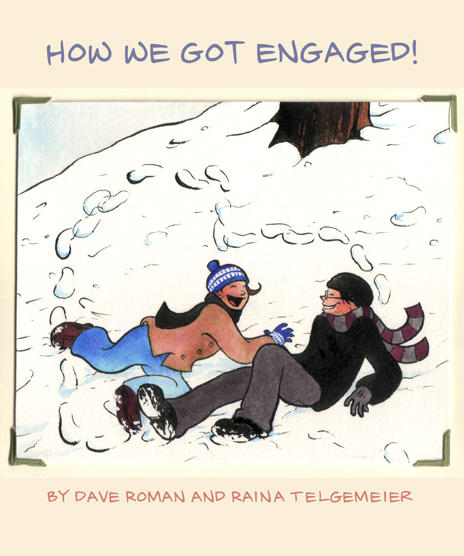
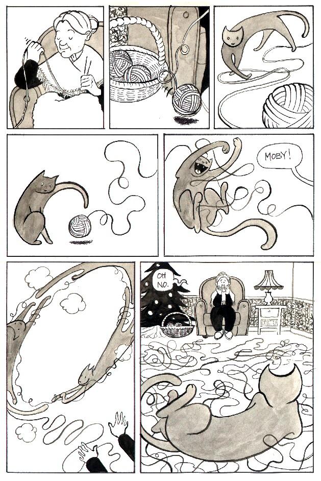
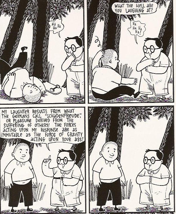
But just in case you haven’t go read this adorable little web comic from two talented mini-comic creators, Dave Roman (Astronaut Elementary) and Raina Telgemeier (Take Out). Go read, it’s cute. It’s very cute, as cute as this page from Raina’s first issue of Take Out.

Tuesday, September 13, 2005

Hey Everybody, It’s Comics by Cathy Leamy

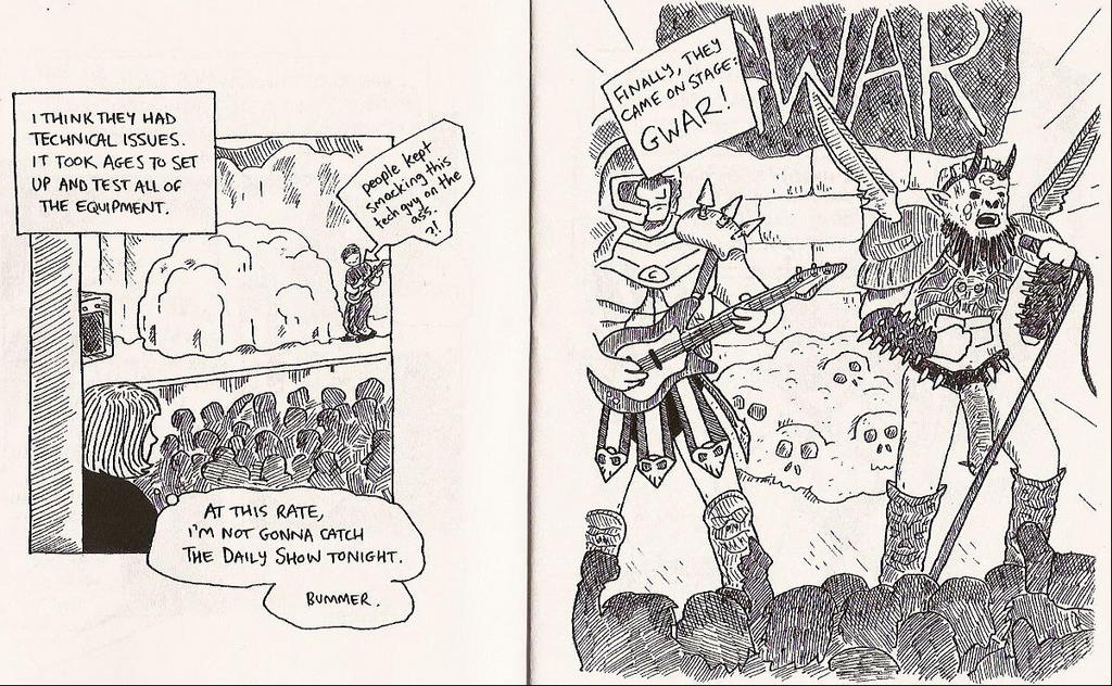
I’ve got to start out here with I Survived Gwar. Give this comic to anyone, anyone I say, and they will think it’s cute. In this twelve-page (fourteen if you count the inside and back of the back cover which continues the story) mini-comic, Leamy spies an ad for the Gwar concert in the Boston Sunday Globe. “It was listed in the arts section, right next to ballet and jazz performances, which was a bit weird.” So what does she do? She goes. She picks out some clothes that wouldn’t stick out and wouldn’t “show stains” and she goes to Gwar. I like her already.
This is the most Gwar inspired fun I’ve had since the scene in Empire Records where the dude is eating pot brownies and thinks that Gwar is talking to him through the TV. Leamy draws the only conclusion one can from seeing Gwar in concert – they are kind of silly. What makes this mini absolutely hilarious is the picture of Leamy on the cover. She’s dot-eyed and freckle faced, and her arm is raised skyward with forefinger and pinkie pointing to the sky. Rock on Cathy Leamy. The back cover shows her leaving the concert wrapped in a long coat and scarf. Definitely not Gwar approved clothing.

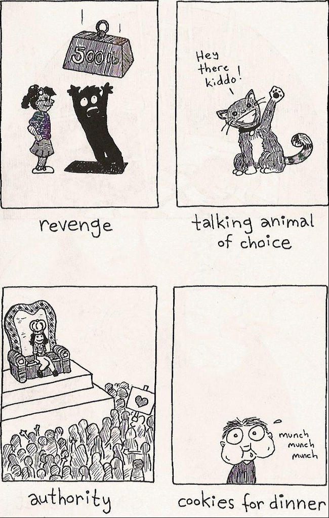
Leamy also sent in two issue of her mini-comic Geraniums and Bacon. the first issue has the wonderful “Little Kid Dreams” piece where Leamy illustrates the kind of things that we all wished for as kids. Talking animal of choice, check. Picked first for kickball, check. Each page of this section is simply four separate panels with a title underneath. It’s a nice way to start a mini with something almost all of us can relate too. There are a couple of other short pieces including one that details her yearning to be good at something.

The longest story in this first issue is “Faith Crisis.” In this one Leamy outlines the struggle that most thinking individuals go through in regards to religion. But isn’t it all just a sham, she wonders. This one goes on a bit too long, but she redeems herself on the last page as her mother brings her character back down to earth.

Geraniums and Bacon issue two is a bit of a departure from number one. Leamy whips out a can of “Writer’s Enlightenment” to jazz up some pedestrian tales. The second such tale is almost startling in the way she blends fantasy with fiction. There’s an ad for “Lysol Gay-Away” that enterprising young homosexuals can spray to erase all trace of a gay lifestyle when parents pop in for an unexpected visit. Leamy closes the issue with an extended dream story where she discovers a land of geometric figures and gets overwhelmed by bees. The next thing you know she’s the voluptuous “Goddess of Sex and Math.”

Leamy’s art is uncomplicated and simplified. Her backgrounds give just enough information for the reader to process the scene and no more. It’s an example of her using what she’s comfortable with, without sacrificing content and entertainment. Cathy’s blog is at Metrokitty.com. Her comic section is here and you can read the one page story "The Adventures of Milo Mercury and Ginger". You can also find her comics at Small Press Swap Meet.

Sunday, September 11, 2005

Brian Ralph Cover to 2005 SPX Anthology

Anyone excited yet about SPX? I'm pretty psyched and if Ed calls me the day of this year with a sob story, I'm grabbing David and Eliot and we'll drive to Pennsylvania and drag his ass to Bethesda.
Back to the real world
Just got back from a wonderful weekend in Northern Michigan at Kate's grandparent's house on the lake. I didn't grow up near a lake, but now I wish I did. It was beautiful weather for boat rides and we took the boat dock apart for the winter. Fun times! There wasn't any internet access and I didn't watch any TV or hear any news (okay, I peeked in on the Notre Dame/Michigan game Saturday, I'm not a monk).

But anyway, when I got back home I was reminded of Hurricane Katrina and the terrible tragedy that's still unfolding. And I had this message in my inbox:

Email JP at jp@onepercentpress.com or visit the website.

Friday, September 09, 2005

Rob Croonenborgh's Punch and I Love Short Shorts
A couple of years ago, and in a galaxy far, far away I reviewed mini-comics from time to time at another website. I even had a contest encouraging people to make their own mini-comics and email me scanned pages. There was a forum where all of the neat entries were posted and lots of fun was had by all. But that was a long time ago. And those links no longer exist. But there was this guy, Rob Croonenborghs from Belgium, who sent in an excellent mini-comic called Punch. Fast forward and I get an envelope last month from Belgium and it’s Rob again with Punch and another called I Love Short Shorts.

Punch is a 28-page mini-comic featuring a handful of stories. My favorite was the more minimalist “Mr. Ule.” Mr. Ule was having a very bad day trying to board the school bus, but his troubles would turn out to be much worse than that.

The other stories were pretty solid, but Croonenborghs’ art can get kind of heavy to my eyes. It’s really not bad to look at, the skills are all there and he has an interesting approach, but there’s a lot of black ink on the page. Many of the pages and gutter spaces are black, so it gives the whole story a heavier, inky feeling. “Mr. Ule” and “A Trashcan Love Story,” with their white pages, really opened up the art a bit and made the book more balanced visually.

There are a couple eye-popping scenes on the inkier pages though. The fifth page of “Zombie Country: Billy and Bob’s Big Vacation” is a stunning page. No amount of ink and shadow can hide the care that Croonenborghs put into structuring that page.

I Love Short Shorts feels more like a comic-comic rather than a mini-comic. It’s smaller dimension-wise than your standard comic, but it’s 32 pages divided into three sections. In Punch Croonenborghs handles the art and script, but in Short Shorts he takes care of the art and script in the western-themed “When the Shit Hits the Pants.” In the other two tales Croonenborghs manages the art while Alex de Campi (“6 Characters”) and Matthew Craig (“Healing Hans”) take over the writing chores.

I was pleasantly surprised by both “6 Characters” and “Healing Hans.” It’s no secret that I would rather read a story where someone functions as a cartoonist (both art and writing) rather than read something by a creative team. It’s a preference I have. It doesn’t mean that I’ll ignore or dismiss something by a creative team; it just means I have a preference. De Campi’s tale is an atmospheric meditation on the creative process and Croonenborghs’ moody art suits it perfectly. Here the black pages and borders are a natural fit as a writer seems to be haunted by a book that she hasn’t written yet. She’s obsessed with it regardless of how much time she’s spent putting pen to paper. This is a great short story and it’s the first thing I’ve read from De Campi. She’s got a website and it looks like I’m woefully under-informed about any other work she has done. I need to get out to the comic shop more.

“Healing Hands,” written by Matthew Craig and illustrated by Croonenborghs, is a super hero story. It's one of thousands written published every year, but it feels more comfortable than your standard super hero story. Hans was smaller than his friends and the bullies at his school, but he was angry and not afraid to use whatever object he found at hand to defend himself. Of course this path leads to trouble and Hans has a difficult life until he’s visited by a stranger who teaches him the way of the “blue-flame.” This story feels a little unfinished and there are obvious similarities to many other origin stories (That’s a difficult trick to set your character apart. Well, my character was eating a strawberry Pop-Tart that had fallen into a vat of radioactive fluid, when he was bitten by a strange black widow spider…), but this short tale felt more organic, more alive. Maybe it’s the lack of flashy color and shiny pages, but “Healing Hans” felt more real than your standard super hero fare.

You can read a color version of “Healing Hans” on Matthew’s website. While you're at Matthew's website read his Hondle the Dog stories. Hondle's a good dog.

Email Rob Croonenborghs (Rob_Croonenborghs@hotmail.com) for information about how to get your hands on Punch or I Love Short Shorts. Rob’s got a unique perspective and visual style that doesn’t always work for me, but when it clicks, it really clicks.
Mini-Comic Artists Getting Involved with Hurrican Katrina Relief Efforts

From Warren Craghead:

For a 25$ donation I will draw ANYTHING you want - name it, I'll draw it, or if you like I'll pick something. I'm a pretty good drawer. The drawing may include collage. Contact me via email. I'll do this project for one month, until October 2, and I'll post here what I send out.

Details are here.

Also from Rob Ullman:

Through the end of September, all profits earned via sales of original art though the website will be donated to the Red Cross for the express purpose of aiding victims of Hurricane Katrina.

Details here.

And since, I’m already bumming you out… If you are in a position to donate money to the relief effort, I’ve added a donation link to the right for The Humane Society’s Katrina Disaster Relief Effort. I know the human suffering is overwhelming, but it kills me to think about all of the pets left behind in this disaster. I don’t know about you, but I would be one of those crazy people on the news refusing to leave without my cats. The Humane Society has assembled teams to save animals in the hardest hit areas.


Here is some information from the latest HSUS disaster relief update:
Dear Shawn,
After initially being blocked from entering the most devastated areas in Louisiana and Mississippi, HSUS Disaster Animal Response Teams (DART) have been working around the clock to help save stranded and sick animals.

What we are finding is truly heartbreaking – animals trapped in flooded houses, caregivers wandering the streets desperately searching for their beloved pets, and nearly destroyed animal shelters where the surviving animals have spent days keeping their heads above water in their cages.

But this is why we are here and why we are counting on our supporters to help spread the word about our disaster efforts on the Gulf Coast.

Block after block, our teams are entering homes and apartments, sometimes forced to break into them, searching for stranded animals.


Again, if you can donate, please do so. Here’s the Humane Society’s webpage if you’re interested in learning more.

And email Warren Craghead and make him draw you something crazy for a $25 donation.

Thursday, September 08, 2005

Joey Weiser's Rejected Strip for SPX 2005 Anthology

Yes, the 2005 SPX Anthology is going to be amazing. That's an impressive group of contributors. It's a shame though when fun strips like Joey Weiser's don't make the cut. Check out his submission here. It's fun stuff.

Wednesday, September 07, 2005

See How Pretty, See How Smart #3 by Sean McCarthy and others
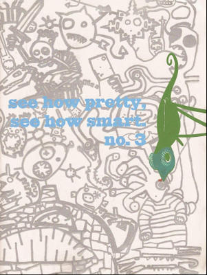
Sean McCarthy’s See How Pretty, See How Smart is not only the perfect showcase for his own work, it’s an opportunity for other Partyka members and allies to do pieces shorter than their own projects. Each section of these books takes up only two to six pages and the shorter format/shared environment seems to allow for greater risk taking. The physical size of this book is much larger than a typical mini-comic and it needs to be, especially considering the space that McCarthy’s images need to slowly writhe and creep their way into your brain.
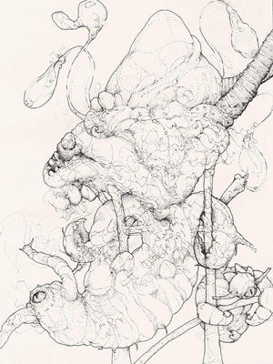
Sean’s work is equal parts beauty and horror. He mixes bold lines and stippled patterns of pencil and ink to create a monstrous orgy of animals and beasts devouring, fighting, fucking, and evolving. Lost within the body of beasts are swirling pencil point patterns that meander and converge into recognizable figures. A quick glance gives you a simple impression of intertwining creatures, but a closer inspection reveals an amalgamation of bodies, organs and limbs. In issue four of See How Pretty, See How Smart, Sean gives you a peek behind his work in the form of rough sketches that are as fascinating as the finished product.

Sections by several other creators fill out each issue of See How Pretty, See How Smart. Issue three has work from Sean McCarthy, Andy Bodor, Zak Smith, Craig Taylor, Jeffrey Lewis, Shawn Cheng, Theo Rosenblum, and Matt Wiegle.

The cover to issue three by Sara Edward Corbett and Zak Smith is endlessly fascinating and the inside of both front and back covers feature John Mejias designs. Inside issue three things begin with Andy Bodor’s “Bunny and Ghoul.” Bunny and Ghoul stayed up too late watching “dancing dawgs,” and then they arrive at the radio station just in time for an on-air appearance. I’m not sure why they’re applying make-up for a radio gig, but things don’t go very well for Bunny and Ghoul. Bodor has a pleasant chunky style of drawing that uses rounded, stocky figures and ink wash backgrounds. Occasionally, he uses type font in addition to lettering, but it’s usually to drive home a point or to indicate the voice of someone other than the two main characters. The story is absurd, but kind of charming. The first panel is a close-up of the bunny and the ghoul sleeping in bed. The bunny has his mouth wide open as if he’s snoring and the ghoul has drool dripping from his mouth.

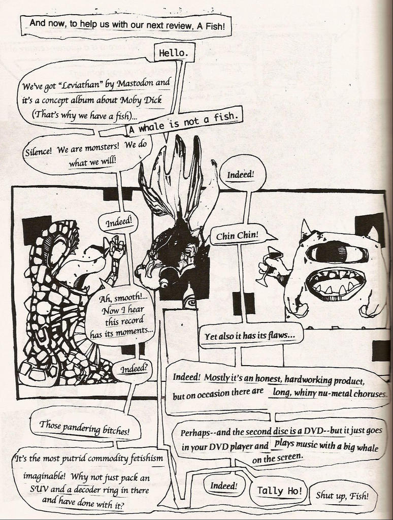
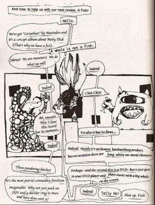
After five full page drawings from Sean McCarthy, Zak Smith has a bit called “Monsters Review Records” with two martini slurping monsters, uh, reviewing records in the voice of “distinguished gentlemen.” Here’s a page for your enjoyment.
Craig Taylor also provides seven pages of fairly abstract work titled “Marginalia of an Aesthete.” I would have liked to see these in color rather than black and white. The forms and shapes are interesting, but having only black and gray minimizes the effect of the images a bit. Taylor has an absolutely startling image to begin his section of issue four, which I found more remarkable than his work in issue three. Taylor also provides the striking cover to issue four.

Jeffrey Lewis has a four-page low brow Canterbury Tales strip titled “The Canterburied Tales” in issue three. Each character tells their story and each one is more far out than the previous tale. I’ll give you four words to describe this story: zombies, necrophilia, and Einstein’s brain. Lewis’ section most closely resembles a traditional comic format, but it’s EC Comics meets Robert Crumb.

Next, Shawn Cheng fills four pages with drawings of “100 Boys.” Each boy is actually a young monster and one of them looks like the guy in Vengeance at Cackling Mountain.

Theo Rosenblum provides a creepy “The Birth of Death” story that tracks death from an asteroid, a graveyard, a reanimated alligator and then finally into a regurgitated dog’s body. Initially I was turned off by the unfinished pencil shading in used in this strip; it gave the story an almost unfinished look. But the playfulness that Rosenblum uses with the art in his section overcame my hesitation. Rosenblum’s version of death snakes though panel borders in this silent tale and there’s a delicious glimpse on the second page of the story of what lies below the buried caskets in the cemetery. There’s a cavern with pipes and attached machinery, as well as a beast holding onto a burning torch that lights up the cavern. Theo, where's the mini-comic featuring this cavern, already?

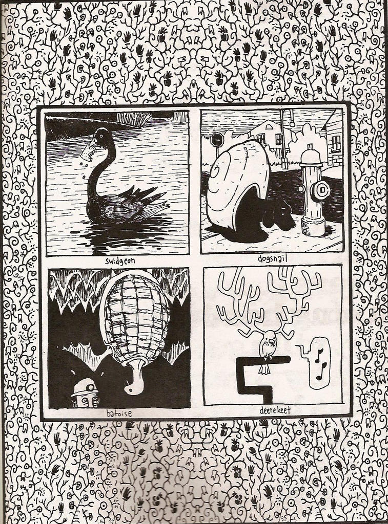
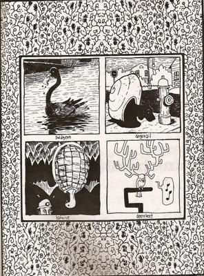
Matt Wiegle closes the book with two pages of made up creatures. I’m charmed by anything that Matt puts down on paper, so these were a perfect way to end this issue. Here are four of his creatures for you to enjoy.
See How Pretty, See How Smart is about monsters. It’s about the slightly surreal. It’s a way for Sean McCarthy and friends to stretch their imagination and art in a collaborative environment. It may not be for everyone, but it works very well for the brave or the foolish. Here’s the preview link where you can check out several more samples of art from issue three featuring Andy Bodor, Sean McCarthy, Zak Smith, Jeffrey Lewis, and Craig Taylor.

I’ve got a few more mini-comics to review from Partyka, but they will be spaced out a bit over the next month or so. I really hope you’ve found something that you like between the four books that I’ve reviewed so far. Again, check out the Partyka online catalogue for some online samples of their work.

Again, I’m sorry for the delays in posting this week. Everything is back in order at the Size Matters office and there is a large stack of minis just waiting to be discovered.
Techincal Difficulties have hit the Size Matters offices.

I haven't had internet access at home, but that's being fixed tonight. Look for a post on Sean McCarthy's See How Pretty, See How Smart very soon. Then we'll be back on a regular schedule. Sorry for any delays.

Thursday, September 01, 2005

See-Saw by Sara Edward-Corbett

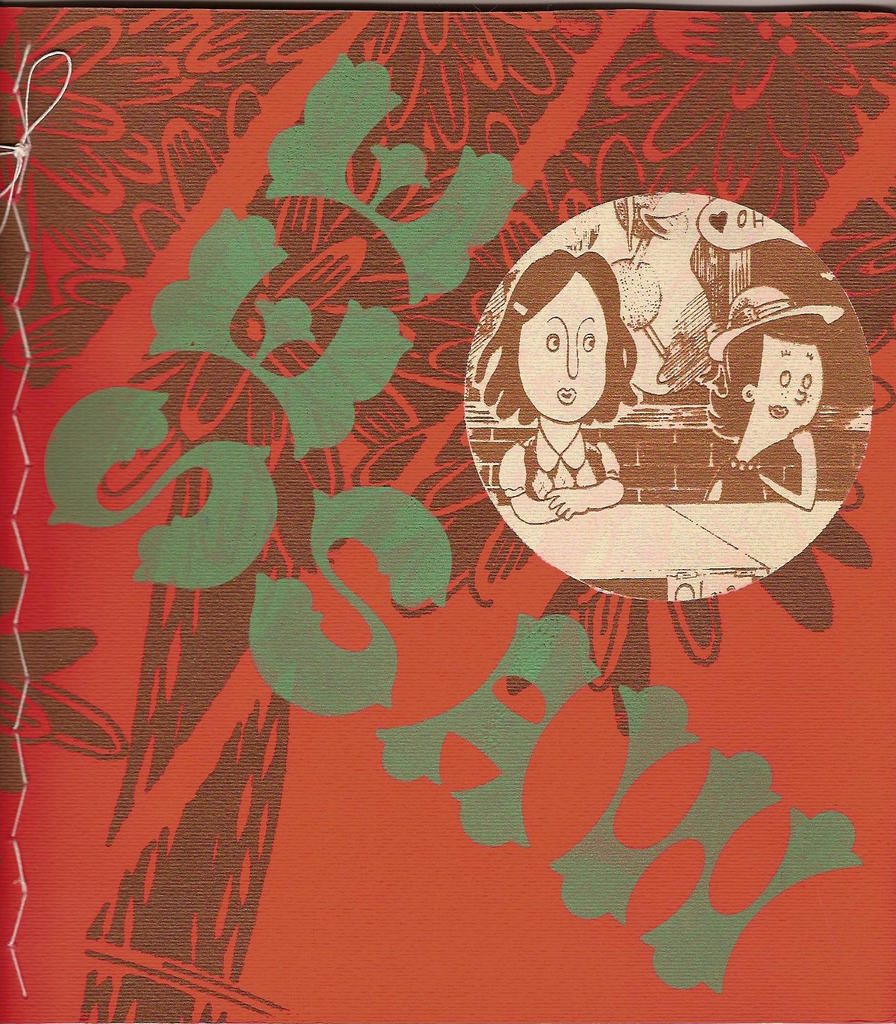
Continuing our Partyka theme this week, we’ve got Sara Edward-Corbett’s See-Saw. This mini is a collection of her See-Saw strips from The New York Press and it’s a gorgeous book.

First off it’s kind of big (8.5” x 9.25”). I had a difficult time arranging it to fit in my scanner. The cover is double-layer stiff red paper with a three color silkscreen design on the front. I think the Partyka offices may have run out of staples at some point, because this one also has a hand-stitched binding. Inside the back cover she has sewed a piece of thick felt fabric that has a silkscreened picture of a duck holding an umbrella. This felt creates a small pocket that holds a neat “cootie catcher” (I had no idea that that’s what they called those things) with sketches on each of the folded surfaces. She has put a lot of work into this collection, it makes me weary just thinking about it.

On the inside there are 36 pages with full page strips from The New York Press. The art in these strips is meticulous and warm. The backgrounds are heavily detailed; Edward-Corbett has definitely got skills when it comes to creating interesting backgrounds and objects. Her classroom desks and walls are so well-rendered that you almost feel like you’re back in grade school. On a couple of pages, you’ll notice a picture of a duck on the classroom wall that matches the felt duck on the inside back cover. You don’t see too many ducks with umbrellas.

The strips in See-Saw are solid and often hilarious. The cast of characters revolves around two girls and two boys and the very weird things that they say and think. As in Peanuts, out of the mouths of babes comes very adult conversations and phrases, but then there’s also plenty of juvenile fare. Chucky’s favorite term is “Fart Knocker,” and yes, one of the characters actually tries to puzzle out what the term means. The set up is this: One of the girls, Meals, is in love with Chucky, but he wants nothing to do with her attentions. Olga and Georgie are brother and sister. Olga is best friends with Meals and Georgie has a weird relationship with Chucky. Georgie and Chucky are friends, but Georgie takes a lot of abuse from Chucky in these pages.

See-Saw is 36 pages and it will set you back $8. Feast your eyes on
a four page preview
, though it’s really eight pages as each preview page actually shows you two facing pages.

Once again, here’s the website for you to explore.