Tuesday, January 31, 2006

The Drama
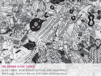
The latest issue of The Drama arrived in the mail yesterday. As usual, it’s good stuff from front to back and there are a ton of one page comics in the back of the issue.

Here are the details from the website:

-104 pages, perfect-bound, wrap-around cover and 12-page feature/interview with Elvis Studio, conducted by Alvin Buenaventura.

-Interviews with Julie Doucet (conducted by Dan Nadel) and AJ Fosik (conducted by Matthew Newton)

-How-to lesson from Rad Mountain; Ryan Waller and Garrett Morin

-Chromatics tour diary

-"Where Art and Commerce Collide" by Ed Looram, featuring interviews with Augie Galan, Steven Nereo, Karl Peters, Jeremy Dean and James Widegreen

-'This It', our comics/writing supplement, featuring comics by Tom Gauld, Brian Ralph, Zak Sally, Nicolas Robel, Leif Parsons, Tom Kaczynski, Paper Rad, Ron Rege Jr, Marc Bell, Vanessa Davis, Max Hubenthal, David Heatley, Mark Burrier, Alex Lukas, Dash Shaw, Oura Sananikone and Travis Robertson, a story by Steve Almond, and more.

-Contributions from Loyal, Junc, Sara de Bondt, Dan Monick, Jason Frank Rothenberg, and much more.

To look at page samples from issue seven go here.

I’ll be back tomorrow with another review. This week, I took a closer look at my review pile and it’s down to less than a dozen mini-comics. What this means is that I’ll be integrating mini-comics from SPX and other minis that have been pushed to the side to make way for reviews. Fun times are coming…

Monday, January 30, 2006

Friends Issues 1 and 2 by Francois Vigneault
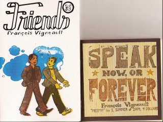
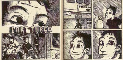
Issue one of Friends has a wonderful, organic feel to it when you hold it in your hands. The thick, brown cover has a thin layer of wood pasted to the front, and it’s on this wood that the title, “Speak Now or Forever,” is stamped in the style of an old wanted poster. This is one of the most interesting mini-comic covers I’ve seen in some time. Inside, the pages are a light butter color usually split into four equal sized panels. Vigneault’s art is warm and I enjoy the way he draws his faces. Sometimes your initial reaction to a comic can color the way you judge it, and this may be one of those times.

Whether he purposefully left earlier faint pencil lines in some panels or not, they are often quite noticeable. This is especially noticeable when you look at the lettering; the ruled lines are often visible as though they weren’t fully erased. I wasn’t bothered by this at all, which is strange because I’ve probably complained about that on another mini-comic before. In this first issue of Friends, the faint pencil lines are almost like seeing through the skin of the story. It’s like you can see the bones, muscles and ligaments, and it adds to the organic nature of the book. The art feels rich and fully realized, but strangely the level of detail isn’t high. The panels feel textured rather than inked, if that makes any sense.

The story is a simple one, Chris is traveling on a bus and he spies an attractive blonde girl. She’s the one thing on the bus that stands out (Vigneault does a nice scene where hers is the only night light on in the bus as it hurtles across the darkened interstate). During one food stop, they share a table together and chat. Their conversation captures that easy-going feeling that you get when you find someone with your own sensibilities in a busload of strangers. There are three parts to this mini-comic and the middle section is six pages of prose with small illustrations. It’s a pleasant touch that I wouldn’t mind seeing more of in comics sometimes. Yes, it’s a short cut or you could say it’s taking the easy way out, but it really helps flesh out what a character may be thinking or doing at a particular time.

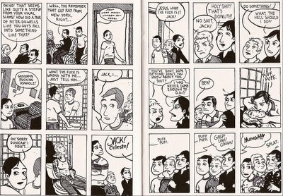
Issue two of Friends is a different beast. It’s taller dimensions wise and the cover is a bright white with a silk-screened image in three colors. Inside the pages are a bright white with nine panels per page. The art is sharper than issue one, but the backgrounds are less fully realized. The art in the main story, about two friends both named Jack taking off to Vegas to join a band of card counters, just doesn’t feel as warm as the art in issue one. Often several panels in a row are just talking heads against a white background. Vigneault does a nice job mixing up the panels, but this one feels a bit flat next to the first comic. By itself, it works. Compared to the first issue, it falls a bit short visually.

The backup story, actually more of a sketchbook story, is about girls that he has developed crushes on. This section feels a bit warmer, although it’s rougher art wise than the main story. As a sketchbook, it feels more human. Or in other words, you can see a human hand at work.

Issue one of Friends is 32 pages for $4. Issue two is 24 pages, but almost twice as tall as issue one. This one will run you $3.

You can visit Family Style.com for a peek at Vigneault’s comics, including 13 pages of his sketchbook crush comics. You can purchase mini-comics using PayPal in the Family Style store.

Sunday, January 29, 2006

Sammy Harkham's Poor Sailor by Gingko Press

I wrote this appreciation of Poor Sailor for my Comic World News column, but then I realized that mini-comics fans would probably dig a peek at this hardcover version as well....

Just when I’m getting completely fed up with all the chatter about how to save comics and what’s wrong with comics, a package arrived on my doorstep that reaffirms why I love comics so damn much. The package was a surprise, a book that I didn’t even know existed, and one that I didn’t even know was in the works.

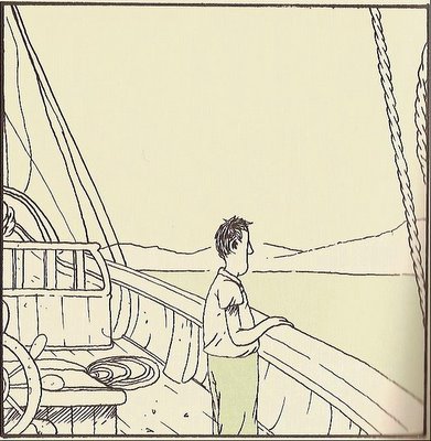
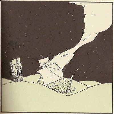
It was a hardcover version of one of the most memorable mini-comics of the last few years - Sammy Harkham’s Poor Sailor. This little gem has been sold out at the usual outlets for more than a year, but luckily I could still point to it’s appearance in Harkham’s excellent anthology Kramer’s Ergot (volume 4 features Poor Sailor). Unfortunately, the format of Poor Sailor in KE4 isn’t as arresting as that of the mini-comic. The panels are four per page in the anthology, and increasing the panel per page count messed with the rhythm established in the mini-comic edition. With the hot off the presses Gingko Press hardcover, however, the format has returned to the original single panel per page layout.

Sammy Harkham’s Poor Sailor, inspired by Guy De Maupassant’s At Sea, is a haunting tale of loss and recovery told in an unusually restrained and subtle manner. As I’ve already mentioned each page is a single panel of story. The panels are sparse, often simply pictures without words, and as you flip the pages you fall into an easy tempo with the story. The flipping of the pages actually works to pull you in; you’re the engine that propels Harkham’s tale onward. You become a part of the book, which seems like a given in comics, but it so rarely works so effortlessly. Reading Poor Sailor is one of those rare, magical experiences that makes comics just so special.

Thomas, the “sailor” in the book, enjoys a quiet life with his wife Rachel. They live in a simple thatched roof hut that’s surrounded by rolling hills. At night, they sleep holding onto each other. They gather the clothes off of the line as a couple. They walk hand in hand under the gaze of the full moon. They stare into each other’s unblinking eyes, holding hands again, as they stand naked in the water of a waist deep pond. It’s an ideal world for the couple – until a man with a mustache appears on the horizon.

The man is Thomas’s brother Jacob, a sailor who is in port for just a few days. Using stories of his exploits, Jacob fills Thomas’s head with alluring visions of the open sea and exotic ports of call. The next several pages show Thomas and Jacob walking over the rolling hills; Rachel doesn’t show up again until Harkham shows the couple at dinner one night. It’s not said in the comic, but you know what Thomas is asking as they sit at the table. Rachel is adamant in her refusals, “No Thomas. What about the house? What about me?” Thomas just stares into his plate, his knife and fork held helplessly in his hands.

After that dinner, Thomas stares a lot. He stares into the horizon when he’s chopping wood, he stares into the darkness as he tries to sleep. And then one night, sitting up in bed he says Rachel’s name softly. He repeats it once and then touches her sleeping figure with his hand, whispering, “I’ll come back soon.”

At this point you’re only a third of the way through the book, there’s much more to come, but it’s a dividing line in the tale. Harkham has said so much with so little words up to this point. He uses the visual language of comics to show a happy couple, and then just like that Thomas is gone. We won’t see Rachel again. Well, we will see her in a way much later in the book, but now the book becomes Thomas’s story alone. Thomas does go to see with his brother. But his decision is costly.

His experiences at sea are lively and varied. It’s a new life for Thomas, but one day, during a rare, quiet moment on the side of a hill, he pictures his wife Rachel. There aren’t any thought balloons to telegraph what he’s thinking at that moment, but it’s obvious. He’s wondering if his decision to leave his simple life was worth it, especially in light of what his decision costs him at sea. (I’m not telling you what happens, but he does eventually return home).

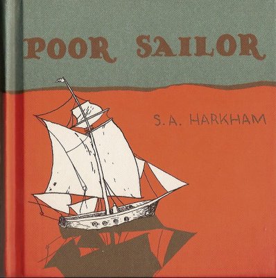
In this format, Poor Sailor reminds me of a children’s book designed for grownups. It’s got that colorful children’s book cover. Across the top is a pale green sky with the title floating in orange; underneath the title, you find a white ship with sails full of wind slicing through an orange sea. Inside, the bright orange from the cover splashes across the endpapers. As you flip to the story, the pages turn green, giving you a preview of the only color used to offset the black and white of the art. The dimensions of this 128-page book are perfectly square at 5 ½” x 5 ½”.

This Gingko Press edition was published in December of 2005 and it retails for $14.95. I also suggest a peek at Sammy Harkham’s website. Good stuff.

Sunday, January 22, 2006

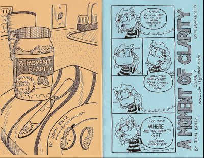
A Moment of Clarity by John Bintz

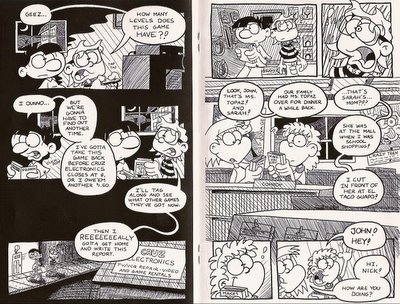
John Bintz mines childhood memories and anxieties, mostly the fear of getting beat up, in issues 6-8 of A Moment of Clarity. In issue 6, eleven year-old John is speeding home on his bike just in front of local bully Tyler. He only manages to escape with the aid of an adult neighbor. In issue 8 John stumbles through a day of school living in fear of the after school beating that Tyler has again promised to deliver. Sandwiched in between these two issues, number 7 deals with a school assignment deadline and an awkward crush on a girl named Sarah.

Each issue of A Moment of Clarity is a quick read clocking in at 12 pages, but Bintz has kept the price tag low ($1.50 on issues 6 and 7, $1.25 on issue 8). Bintz’s art reminds you a little of the animation of the Rugrats. It’s got that exaggerated effect and detail that appeals to kids. Look at the square faces with big eyes and glasses, or the tiny shoulders that lead to skinny arms and oversized hands. This style works well with the type of stories that he tells, and you’ll find a great deal of variation in page format.

I think Bintz is experimenting a little with each issue. He’s trying new things out, at least things new to him, and he mostly succeeds. He skimps a bit on background detail; the backgrounds are more suggestions than settings. The figures and the conversations that take place are always front and center anyway. The most successful book here visually is issue 7. Issue 6 feels rushed and the character design of the neighbor doesn’t fit well with the design of the other characters. On the back cover of issue 8, Bintz tells us that he “tried to take the art up another notch or two,” and I can see that attempt, but it doesn’t work quite as well as the less adventuresome style of number 7.

John Bintz has an excellent website and just reading through it you can sense his excitement for creating these comics. He's posted issues 1 and 2 online and he's already finished with issue 9. He also has a collection of the first five mini-comics available on his website along with all the other issues. Click on The Comic to check out A Moment of Clarity and to find out what issues are available.

Tuesday, January 17, 2006

2006 Isotope Award for Excellence in Mini-Comics

From mini-comic maniac, James Sime:

Submit Now: 2006 Isotope Award for Excellence in Mini-Comics
SAN FRANCISCO (January 16th, 2006) Acclaimed San Francisco comics retailer James Sime, proprietor of Isotope - the comic book lounge, announced today that submissions for the 2006 Isotope Award for Excellence in Mini-Comics will be accepted until March 15th at midnight. "The beginning of the new year always rings in that moment of true greatness for our industry's mini-comic creators," Sime ranted to Shawn Hoke, mad genius behind the awesome Size Matters Blog, "It's time to fire up your printers and copy machines again, and to score yourself some of the gold and the glory that is the fourth annual Isotope Award for Excellence in Mini-Comics!"

This coveted award, known internationally for launching the professional comic careers of Rob Osborne (1000 STEPS TO WORLD DOMINATION), Josh Cotter (SKYSCRAPERS OF THE MIDWEST), and Daniel Merlin Goodbrey (THE LAST SANE COWBOY), is a beautifully hand-crafted statue sculpted by designer Crowe made entirely from carved ebony fossil stone and satin silver. "It's the pointiest award I'm aware of," AdHouse Books publisher, Chris Pitzer commented, "It could sure do some damage. It also throws the lucky mini-comics creator into the spotlight of the Alternative Press Expo. THAT could mean added sales of your comic, more invites to parties, and a possible deal with a boutique juggernaut of publishing, like AdHouse Book. In the end, it's your chance to reach for the stars, with your feet on the ground."

The award selection committee for 2006 remains a mix of comic aficionados, entrepreneurs, artists, and industry impresarios. Including self-publishers, mini-comic creators and, of course, a person who sells comics for a living, "Everybody in the industry already knows how this works, we like to keep the committee fresh by bringing in new blood each year, but still ensure that the Isotope Awards Committee covers the entire spectrum of the mini-comic equation," Sime declared, "Like last year I'll be on the judging committee once again, as will be PopImage columnist Jason McNamara who has a voracious appetite for minis and always keeps his finger on the pulse of what's happening. Representing for the classic literature set we've got our comic lovin' Librarian in the form of Isotope Special Projects Director Kirsten Baldock who heads up our judging committee. And for our new additions this year we're bringing on board some individuals I'm very proud to have on our judging committee: the mini-comic creator who blew our minds last year and took home the 2005 Isotope Award for his awesome mini, Daniel Merlin Goodbrey, and comic publisher, Chris Pitzer, who has, perhaps, the most impeccable taste in all of comics.

As always, the only fee for entry to this competition is five copies of your mini-comic sent to Isotope's Special Projects Director Kirsten Baldock at the Isotope address (326 Fell St. San Francisco, CA 94102) before the March 15th deadline. As is tradition, the award will be given out at a grand ceremony during APE AFTERMATH at the Isotope in conjunction with San Francisco's ALTERNATIVE PRESS EXPO. San Francisco’s APE convention has been a forum for small and independent publishers in the industry for many years. Because of the nature of this award, the winner will be contacted in advance and must be present at the Isotope at 9 PM on Saturday, April 8th for the award presentation ceremony.

"These award ceremonies are a blast, and without question this year's will be the best one yet!" enthused Sime, "And this year, I've got a sexy new location that's going to rock people's worlds! And it's right in the heart of San Francisco, only a stone's throw from the Concourse Convention Center and any hotel you could possibly want to say at. Trust me, this year is going to Eleven!"

"I've said it before and I'll say it again. Mini-comics are the basement tapes of the comic industry," Sime said, "And just like basement tapes, this is where the raw creative spark is at it's brightest. We're talking the bleeding edge of comics innovation and this is where the industry's superstars of tomorrow are perfecting their riffs and chops today. We want to shine the spotlight on the work these future superstars are making... that's what the Isotope Award is all about! I know you people out there have some great minis, so send them in and together let's show the world how hard mini-comics can rock!"

The Isotope Award for Excellence in Mini-Comics could be yours, submissions of five copies accepted until March 15th at 326 Fell St. San Francisco, CA 94102. For more information contact the Isotope at (415) 621 - 6543 or at isotopepromotions@gmail.com

Well, what the hell are you waiting for? You heard the man.
Wednesday, January 11, 2006

Walking Man Comics by Matt Levin

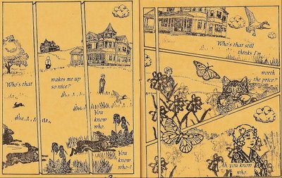
A couple of years ago, Matt Levin sent me some mini-comics done entirely with rubber stamps. I liked the idea and the end product, and said so in an online column. Since then, almost every month a new mini-comic from Matt arrives. These minis are tiny in size and page count (8 pages), but they always brighten my day. Matt is relentlessly positive and many of his comics are in the form of a song or poem.

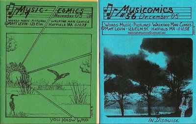
His last two (November and December 05) are "Music Comics." November's (You Know Who) is a reworked verison of an earlier comic devoted to his "sweet-heart's birthday."

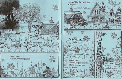
December's issue, number #56 (In Disguise), has a neat visual trick where Matt uses an absurd figure, a giraffe, as a stand-in for the main character who appears in the end. Also in #56, he uses a mixture of black and white photography with the usual rubber stamps. Each issue ends with a key that shows each stamp used in the issue and where he ordered the stamp from. These stamps come from all over, and I can't even imagine the arsenal of rubber stamps that he has at his disposal.

As it says on the inside of one of his sampler mini-comics, "Rubberstamps make it possible for anyone to create great art. Mini-comics make it possible for everyone to share their works!” I hope Matt never stops making these comics, I find it comforting just knowing he's always out there creating these very individualistic mini-comics.

Matt puts out several of these comics per year, and has been printing them for over a decade. You can email him at walkingmancomics@comcast.net. Each issue is a buck, or you can get any four for $3.

Monday, January 09, 2006

Lou Season by David Yoder

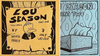
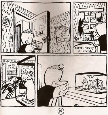
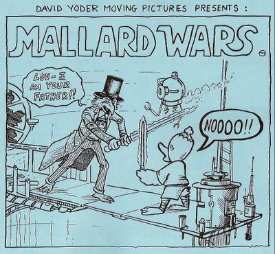
Lou Season is a two part story about a hapless duck named Lou. After his human parents pull some strings to get him into human school, his school debut is ruined by a very unfortunate haircut. Well the haircut and the fact that he’s a duck. His classmates immediately target Lou for abuse, and up to a point he takes their teasing. Luckily, Lou meets a girl named Sally who treats him as a friend, but even more significant, he takes a shine to Candice, the class gerbil.

Lou Season is cutesy in that “Awww, look at the talking animals” way, but Yoder infuses it with enough emotion from our own childhood experiences that it’s relevant. Maybe you weren’t the one picked on in school, but you’re hopefully old enough to empathize with those that were. Lou is one of those misunderstood kids that find solace in escaping from his peers, but in doing so he ignores the girl Sally who aches to be closer to Lou. Oblivious to Sally, Lou treats Candice as his friend and confidant, even though she can only manage a few squeaks in response to Lou’s conversation.

Issue one of Lou Season is breezy and carefree; duck and gerbil have fun in the park and Yoder includes a page of trading cards featuring the four main characters from the story. Issue two gets kind of hairy though, as Candice is stolen from Lou’s room. The gerbil-napper leaves a note and Lou retaliates in an unexpectedly violent manner.

Yoder’s art is boldly brush inked giving his lines a lot of depth. Joey Weiser inks the first issue and David does the second. I enjoyed the cartoony art a great deal; he does a nice job on sound effects and concentrates on only the details that matter to the story.

Lou Season is a wonderful two-part story appropriate for any age group. Each mini-comic is 26 black and white pages and you can email David Yoder through his website. While you’re there Yoder has plenty of online strips for you to read including You Want to Know How I Make Comics?!!?.

I love this back cover with Doug Frey (The Magpie).

Now, go check out Yoder's website and have some fun.

Wednesday, January 04, 2006

Stupid and Unkind by Robin Enrico

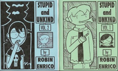
Volumes 1 and 2 of Stupid and Unkind tell the story of Ronan, his ex-girlfriend/current obsession Leona, and Jennet, the girl unlucky enough to land in Ronan’s lap in volume 1. Ronan and his ex-girlfriend Leana are film geeks, they love watching movies and creating their own. Jennet is more into music and likes romantic comedies – a grave social error in Ronan’s eyes.

Since his breakup with Leona, no girl has been able to meet his lofty expectations. But it’s funny, because Ronan isn’t that much of a catch himself. He doesn’t know that, however, and this is the basic triangle of Stupid and Unkind. Filling it out is lots of conversations between Ronan and his friends, Clerks-style at times, and the rise and fall of Ronan and Jennet’s relationship.

Robin has a good handle on the flow of conversation between characters. His speech balloons have long tails at times, making you look a second time to figure out who is saying what, but it’s not enough to pull you out of the comic. Occasionally, he does a neat little trick where the character speaking, when they are not in the panel, will show up in the very bottom corner as a tiny head with a long trailing speech balloon attached. It’s not the first time I’ve seen this used, but it’s handled well here.

The art is on the simplistic side, and sometimes the characters appear to be cookie cutter images of each other with slightly different hair. When the characters are wearing black shirts, it’s difficult to discern which sex they are; I learned to look for the boobies if it’s not a major reoccurring character. But even then, a shirtless Brad Pitt character has boobs. They’re kind of square-shaped though, I guess.

You can read Stupid and Unkind, and other comics, at Enrico’s website. Or you can email him via the website to snag copies of the print versions, or if you live near the excellent Jim Hanley’s in NYC, Enrico says they should have copies.