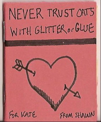
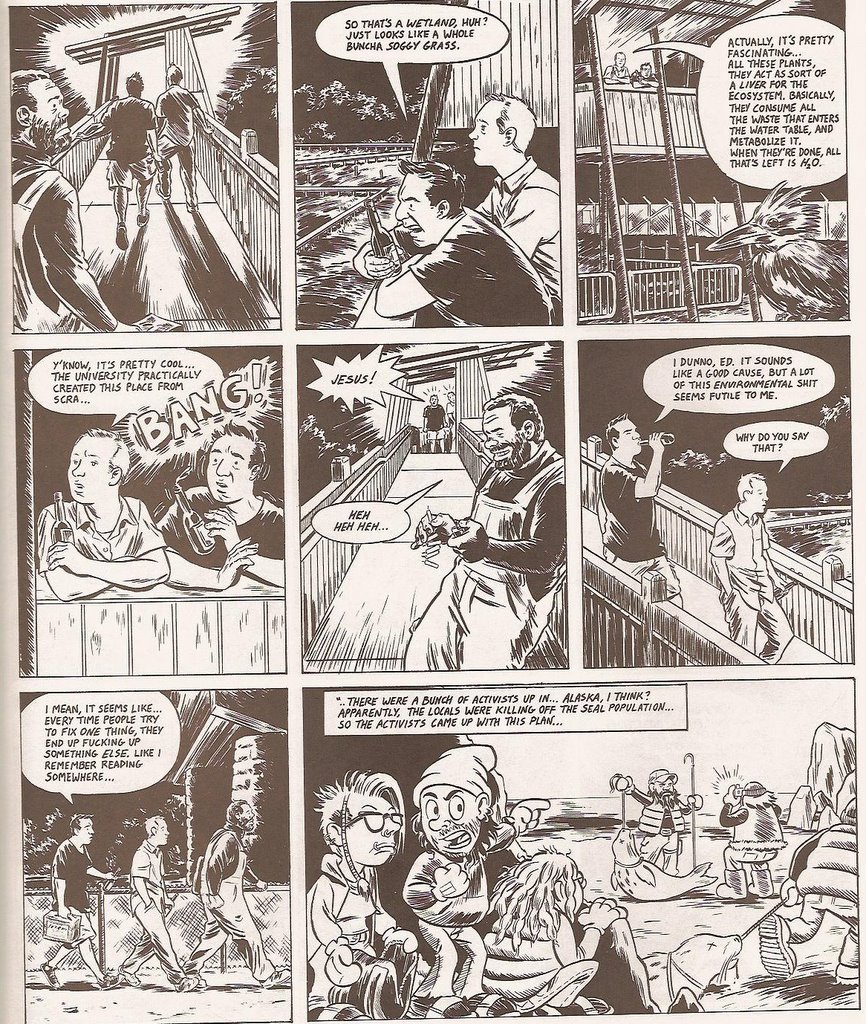
Monday, February 27, 2006

Here are a few pictures of the mini-comic wall at Quimby’s in Chicago. Kate and I checked out some of the Harkham, Huizenga, Nilsen signing and snapped these pictures before the event started. Unless you have one of those panoramic type cameras, it takes two shots to get the width of mini-comics on the shelf.
These two pictures are just the top three shelves; more minis are on the lower shelves as you can see in this picture.
Before the event, I caught Sammy Harkham outside enjoying the brisk Chicago air. As we walked inside he noted how impressed he was with the mini-comic selection at Quimby’s. It's hard not to be impressed. They have one of the best selections of minis that I’ve seen personally,and tons of other great comics, zines, and books. I went back the next day and bought tons of stuff that I'll be reviewing over at my Past the Front Racks column.

Friday, February 24, 2006

Theo Ellsworth’s Web Site is Up
The artist of the current SIZE MATTERS logo has finally got his website together. It’s not complete, but there are some awesome pictures to look at, including this self portrait. It fits perfectly with the caption, “Any day now I shall tell you about myself but for now, I must remain a mystery.”
The Drawing Process

I thought this post by Ben Rosen was neat. He shows the process that he goes through when doing a page of his mini-comic.

I'm always curious to see how people work on their mini-comics.

Thursday, February 23, 2006

Picture Problems
Okay, Blogger and I are having differences tonight. My images would not load as part of the post on unfamiliar art, so I had to load them through Photobucket individually and above the post.

Here's the scoop. I posted an old column that I wrote about three years ago (it's right below the three pictures). In it, I quoted some interesting reactions to unfamiliar art. The three tiny pictures below are a sample from the strip that was discussed in the column. Maybe I'll wake up tomorrow and Blogger will decide to play nice, but until then, the pictures below go with the old column that is below the pictures. Clear as mud?

Image hosting by Photobucket

Image hosting by Photobucket

Image hosting by Photobucket
Reactions to Unfamiliar Art
A few years ago, I wrote a column called “Reactions to Unfamiliar Art.” In it, I used a then ongoing, but now about to be published Sammy Harkham strip called “Black Death.” What was “Black Death” is about to be published in the Drawn & Quarterly comic, Crickets.

This was one of my favorite columns from that time. Not only because I’m such a huge fan of Harkham’s work, but it gave me some insight into how people approach comic art that may be unfamiliar to them.

Here’s the column. Again, a few of the pictures above were part of the strip that inspired the column:


Reactions to Unfamiliar Art
Months ago, Jordan Crane posted the first installment of Harkham’s new story Black Death at his excellent website, Reddingk, and I immediately linked to the strip in The Wall forum (this forum and the original columns are no longer online). It looked like a great beginning to another Harkham story and I was anxious to be able to share the strip with others. The first part of the story received a fair amount of comments, including:

“The art is too crude.”

“It struck me as a bit too simplistic and amateurish.”

Not what I expected, but I should know better than being surprised over reaction to comic art. One of the great things about writing this weekly column is reading posts from readers to unfamiliar artists and comic art. These responses have frequently been illuminating, causing me to wonder why I am so enamored of certain creators and others are less than impressed. To be fair to the individuals quoted and to the artist, the above quotes are taken out of context and do not fully represent the thoughtful responses that this strip received. The full quotes and comments are provided below. You can also view the strip yourself at Jordan’s website.

After posting the link to Black Death, the first comments about the strip were:

“Well, I’m a little freaked out.” –Matthew

And “Ummm…I certainly wouldn’t pay for this.”-Mike

Not a good start, and it got me thinking about why I was so excited about the strip and others had such a negative reaction to it. I asked for further thoughts to clarify why people reacted to the strip the way they did.

Matthew added the following:

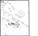
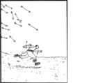
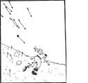
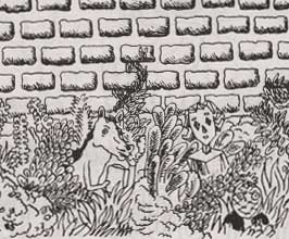
“OK, first off - the figure of the guy is disconcerting. He is disfigured and bulbous and the arrows in him don't help either.
Secondly, while the effect of movement and urgency is achieved well there is no sense of narrative that can actually explain his predicament. As a result it seems emotionally empty and develops no real connection to the reader. It seems reasonless and as a result is disconcerting.”


That gives us something to work with. Matthew intelligently explains why he feels no connection to Black Death. The figure running down the hill seems “disfigured and bulbous.” This didn’t occur to me at all when I read the strip, although I have often groaned at figures, especially in most super hero comics, as “disfigured and bulbous.” Many mainstream comic artists, exaggerate and pervert human anatomy in ridiculous and offensive ways, but these artists are held in high regard by their fans and readers. Therefore, Matthew and I have similar problems with comic art, but we view it in different ways.

Matthew does praise the story for the sense of movement, which is the whole point of the strip at that point, but he has concerns about the lack of narrative to explain the plot. That seems to be a key difference in “art comics” and “mainstream” comics. An “art comics” artist will often allow several panels or even pages to go by, letting the art itself work out the narrative, while mainstream books tend to spell everything out up front. In Sammy’s strip, what is going on seems obvious, but the mystery remains, making me even more curious why the guy is being chased down a hill by a storm of arrows. Thus, I am interested in the strip and the events that brought the characters to this point.

Mike was also kind enough to clarify his initial reaction:

“Essentially, I think the best way to describe this is to tag it with the term "Punk Art". Why "Punk Art", well "Punk Rock" originally came out as a backlash to mainstream music. You didn't have to be a talented musician, you didn't have to have years of practice on your instrument, you didn't need one lick of established songwriting skills...you just had to have the will and the means to produce something vaguely resembling a song.

This strip is just that to me...the guy can tell a story sequentially, but so can I and I wouldn't expect anyone to plunk down cash for my artwork.
I'm not saying it's bad, but when you hold it up against Lee, Di Vito, Basuldua, Kirby, Buscema, etc. it almost borders on the ridiculous.

Again, no offense to the artist, but the story is not engaging, intriguing, dramatic or compelling. So with essentially no worth in what is being told and no crafted art to convey the 'story', it's worth to me is not equal to what I spend my money on...in my opinion.

As to my comments comparing him to other artists, it's not so much the style, but the fact that those folks I mentioned have devoted the time, energy and effort into crafting their skill into something extraordinary. The link above is something I think almost anyone could whip out in very little time, with little or no formal training or practice (I'm not out to detract from what this fellow is trying to achieve, but merely clarify my own personal take on it.) I was merely using the artists I named to reinforce the 'Punk Art' reference.”


Mike and I have very different tastes in comic art (almost polar opposites at times), but I appreciate that he is able to clarify his feelings about Harkham’s strip. Harkham’s style doesn’t meet the criteria that Mike uses to decide how to spend his comic money and that is only something that Mike can decide. My bone with his comments are twofold though, he is judging the work on the first installment only, and he underestimates the amount of work that Harkham put into the strip. I don’t know Harkham personally, but I know his work and I know that he studies animation. He’s certainly not trying to create a hyper-muscled Jim Lee style figure against an overly detailed background; he’s trying to create a sense of movement and urgency, by using a very economical style of art.

Though comic artists study anatomy and spend inordinate amounts of time on getting every detail right, sometimes the details left out are the ones that make the artwork click. I respect the time and the sweat that artists put into learning their craft, especially someone like Buscema or Kirby, both of whom Mike mentioned, but I guess I’m often drawn to artists that use a more spare style of line. Charles Schulz comes to mind; he uses just enough line to let the reader know what’s going on, and then leaves the rest of the details to the individual reader. I think this style helps explain his almost universal appeal among comic fans and non-comic fans alike. By making the reader fill in the gaps, he allows the reader to identify with the characters and the surroundings.

Here is another take on the same strip by Adam:

”Just watching him over the course of those several panels on the first page run from the arrows...christ, he's got that sense of movement that only people like Chester Brown or Frank Quietly have. Mind you what makes this work the most is extreme Tezuka style decompression. He spends sixteen panels to portray the entire chase, which is often this guy rolling down the hill or running form the arrows (with several in him!) yet they are just amazing in the way that this Harkam guy captures the sense of movement. He then uses two panels to show him recovering before he raises his arm triumphantly for having escaped alive, and I feel it captures the sense of recover/relief/victory very effectively for the circumstances. His forms are very simplified and slightly crude, but his sense of movement, pacing, and composition is amazing...makes me wonder if the roughness of the style is deliberate... However, looking at it I don't see this as something that could possibly be whipped off in such a short time. The figure and action and panels move in a manner that's much more natural and limber than his crude rendering suggests. I could pull off a better looking figure than him, but I'd be at a loss to achieve the illusion of movement he creates here.

Adam immediately identifies the sense of movement and the type of forms that Harkham chooses to use in telling his tale. I agree with him that the simplified forms and “roughness of style” seem a deliberate choice by Harkham, and that it would be more difficult than it appears to recreate such a sequence. Sequential storytelling is difficult, and much more difficult when you choose to create a story with such an economical line and a nearly wordless narrative.

Eric adds the following, which captures the feeling that I expected people to have, except for the annoyance part.

”I thought it was amusing but a little "one-note." I appreciate what Paul Weller (Adam) was saying about the sense of movement but honestly, panel after panel of a guy running from a hail of arrows was a little frustrating. During the first few, I was laughing because of the absurdity of it and how long it was being stretched out. Like a movie chase scene that just doesn't end. But (for me at least), it passed the point of being funny and just got annoying. I kept waiting for a payoff that just didn't come.

That second page with what I can only assume is Death waiting for this guy was winning me back though. That was kinda intriguing. Took a long time to get there though.”


Eric did come back to check on the story, so Harkham was able to capture his interest. However, Eric identifies a feeling that seems prevalent to many people who are turned off by “art comics.” The panel pace to payoff ratio is different from your typical mainstream comic. Many readers may be unaccustomed to the slower pace or style that captivates other readers. Mainstream comics are all about “bang for the buck,” which goes a long way in explaining negative reader reaction to Jones’ run on The Hulk or Bendis’ run on Daredevil, both of which I really enjoy.
Todd gets the last reaction:

”The art is too crude, though I appreciate the consistency, and there isn't enough story to suggest that this tale is going to affect me in anyway. Still, the action presented and the questions raised by the characters ability to survive, are intriguing enough to have me add the site to my favorites, so I can check back later on the story.”

Again, the art does not seem like Todd’s cup of tea, but it is enough to have him bookmark the site and check up on the story later. That is all I can ask for and I appreciate the comments left by everyone. I meant to include only negative reactions, but Adam’s comments seemed so in tune with what I got out of the strip that I had to include them. I also picked these comments, because I feel that they mirror common reactions that people have to unfamiliar art styles.

My intent behind this week’s column was not to criticize the reactions by the people that I quoted, but to explore why we feel differently about certain works and ideally generate some discussion about our reactions. Many thanks to Matthew, Mike, Adam, Eric and Todd for their responses, also to Jordan Crane for posting these weekly installments (I hope there are more after the fourth). Sammy Harkham has a website where you can order his mini-comics as well as the anthology Kramers Ergot.

I thought to post this old column, because the strip discussed is basically the strip that you’ll see in Crickets. I haven’t seen Crickets yet, but I’ll be grabbing a copy this Saturday night at Quimby’s. Looking at this old column was kind of fun, I was much kinder back then I think. Jim Lee and art?

Wednesday, February 22, 2006

HELLO CUL-DE-SAC! Exhibit by Warren Craghead

Not sure how many readers have checked out
Warren Craghead’s
mini-comics, but if you haven’t, you should. And if you live near Richmond, VA, you could check out his exhibit opening this Friday (Feb. 24) at the ADA Gallery. The show will be up until March 18th.

In the above piece two things stand out to me: the drawing of a bass and guitar at the top and the pole with the electrical transformer towards the bottom.

The bass and guitar resting on their stands drawing is reminiscent of what I find so intriguing about Warren’s work. Objects are front and center with little or no thought given to their surroundings. The loose line gives his subjects a fluidity and energy not often associated with inanimate objects. Notice the cord leading from the bass as it snakes across the bare ground. Then you notice the Philip Guston-esque head on the ground, outlined in pink marker. It has no business with the subject, but it belongs just the same.

The wooden pole with the transformer on it is another one of those Craghead drawings that makes me want to pick up a pencil and sketch everything in sight. I especially love the little lines that radiate from the transformer, just in case you didn’t know what it was.

Monday, February 20, 2006

Yay, pictures from The Rocketship signing
Over at Beaucoup Kevin, Kevin has posted a Flicker set from the Harkham, Huizenga, Nilsen signing at Rocketship this weekend. Looks like a lot of fun and Rocketship looks like my kind of store. The nicest guy in comics, Gary Panter was in attendance, and it would have been great to hang out with Kevin and Ed. No fear though, this weekend is the Quimby’s event (Saturday the 25th at 7pm). I’ll take my camera this weekend and hopefully post a few shots of the signing and the mini-comics area at Quimby’s.

Also wanted to mention that this morning I noticed a Tom Gauld illustration in the New York Times Sunday Magazine. That was pretty cool. If you haven’t done so yet, go order a bunch of Tom’s comics. You won’t regret it.

Tuesday, February 14, 2006

Happy Valentines Day
I review a lot of mini-comics on this blog, and I'm constantly telling people how easy it is to make your own mini-comics with nothing but paper, pen, and a stapler.

This is an edition of one that I made during a lunch hour. Never Trust Cats with Glitter or Glue is 16 pages and Kate has the only copy. It was done in with pen, first run, no mistakes allowed. Of if you make em' you just keep going. I did pencil the heart on the cover, but the damn eraser made it all smudgy.

Never Trust Cats with Glitter or Glue is the story of what happened when I forced our cats to make Kate's Valentines Day card this year. I didn't want to waste the bandwidth on the whole thing, but here's a couple of pages to show that anyone can do a mini-comic in a minimum amount of time.

Below I've told the cats that if they don't finish the project I will put Kate in charge of their feeding, watering, and litter scooping for a week. She's not real timely when it comes to that stuff and they're rightfully alarmed.


Uhm, they weren't allowed to use scissors, hence the chewed up edges to the card.

After all their hard work I wasn't able to use the card that they created. There was a lot of litter mixed in with the glitter...

Thursday, February 09, 2006

Hondle Special Edition by Matthew Craig

Tonight’s a quiet night. Kate is out at dinner with a couple of friends. I had some homemade pizza and fed the cats. I’ve been sitting here in front of the computer for about thirty minutes, sipping a dram of Lagavulin, and now I’ve got these damn tears in my eyes.

I just finished reading Matthew Craig’s devastating mini-comic, Hondle Special Edition: The Story of One Small Brown Dog and the Little Boy Who Loved Him . See, I know Hondle the dog a bit through some of Craig’s other mini-comics that he’s sent me. I knew that Hondle had died, but Craig had always had the little guy as the mock-hero of these weird made up adventures. Pretty light stuff really.

But for his Hondle: Special Edition, Craig has totally pulled the gloves off. He goes back to the beginning, telling the reader of how he and Hondle met when Craig was just a little boy.

“When I was a boy. I had a dog. He was small and brown, and had green eyes and a little white beard. He had ticklish paws with long claws that clicked and clacked when he walked. He had terrible breath, but he was my very best friend, and I miss him all the time.”

Each page of this mini is a story about Hondle and the crazy things he used to do. If you’ve let an animal into your life, you’ve got similar stories. We all do. I don’t give a fuck what scientists and experts say, animals have personalities. They have weird little habits and quirks. One of my cats pukes almost every day and it drives me crazy, especially when I’ve ran out of paper towels, but if one day she was gone, I’d probably give anything to clean up her puke one more time. Life’s funny like that.

Never at any point do you feel like Craig is trying to tug on your heartstrings. He’s sorting out his own feelings and memories about his pal and saying goodbye, because he didn’t really get to say goodbye in person. Craig was twenty and away at school when Hondle passed away. They were lucky enough to spend seventeen years with each other though and that’s pretty damn special.

Here’s the link to Matthew’s page for this mini-comic. It’s 20 pages and only costs $1.75 US. On this page, scroll down, there are eight Hondle webcomics you can enjoy for free.

Thanks for making me cry, Matthew. You bastard.

Wednesday, February 08, 2006

Cut Flowers by Pat Palermo
My first impression after reading Cut Flowers is that I’m surprised it’s self-published. Palermo has excellent drafting skills and his comic feels like something that you would see from Top Shelf. It’s a full sized format and this version has some wonderfully dull newsprint-like paper, which is nice and glare free. The cover, if this is the final cover, is very subdued with a thickly inked sunflower covering the upper left corner (I apologize, but my cover image file is not working at the moment, I’ll scan in a new image this evening).

Inside, Palermo’s black and white art is polished and quite accomplished. He does a fantastic job with night time scenes and seems to take great care in laying out the architectural angles and other details. In short, the art is precise and appealing. The characters are rendered close to life, but Palermo uses just enough caricature work to make the faces less realistic. Tiny eyes, maybe slightly oversized noses and wrinkle lines add character to the faces without being too real.

Cut Flowers moves quickly. Palermo uses a lot of dialogue to give the story an everyday feel. Hank and Fay are artists who are currently trying not to speak to one another. Instead they yell. Hank storms off and meets up with an acquaintance named John, also an artist, and they go out for beers. John doesn’t drink, but he buys for Hank and another fellow they meet named Ed. John’s got a box full of fireworks though.

The real meat of the story takes place while the three guys are out in the woods drinking beers and talking. Hank and Ed have conversations as they get to know each other, and Palermo does an effective trick while illustrating a brief story that Hank tells his new friend. As they admire the wetland sanctuary that Ed has helped preserve, Hank tells him about a group of activists in Alaska that decided to paint seals bright pink so the hunters won’t kill them for their hides. Palermo does this roughly three panel tale in a more cartoonish style, and the activists almost look like dwarfs from Snow White. One of the dwarves/activists is toking on a bong in the second panel. Anyway, the style here sets Hank’s story off from the rest of the comic and introduces a character that kind of haunts Hank as the rest of the comic unfolds.

Cut Flowers will run you five dollars, but it’s a full sized 32-page comic. You can grab it from Quimbys, USS Catastrophe, and Printed Matter.
Storing Mini-Comics
Here at the SIZE MATTERS offices, we have a lot of mini-comics. They currently reside in three very large plastic boxes from the Container Store. This storage solution unfortunately shows my lack of imagination.

Now, Craig Bostick really knows how to treat his mini-comics.

Craig tells me that Jon Hetman is the Lego architect.

Makes you want to build an elaborate Lego castle to place your mini-comics in doesn't it? Tinker Toys? Lincoln Logs?

Tuesday, February 07, 2006

Harkham, Huizenga and Nilsen Tour

This is like a mini-comics (okay, they’ve graduated from minis, but they still have that all important mini-comic street cred thing going) Super Group Tour of your dreams.

I noticed this from Flog! this morning and I got that jealous feeling that I always get when I see cool stuff happening on the East or West Coast. Then I noticed that the Mini-Comics Super Group Tour will stop at Quimby’s in Chicago on Saturday, February 25th. Not only that, but just yesterday I had reserved a hotel room for that very day, as Kate and I will be celebrating her birthday extravaganza weekend.

I must be living right this year.

Again, Sammy Harkham, Kevin Huizenga and Anders Nilsen, pretty damn exciting and I’ll get to actually check this out.

Monday, February 06, 2006

Fresh Comic Blog of Note: New Bodega

I usually wouldn’t use a post to point out a new comics blog, but this one has the following contributors:

Tom Devlin
Jordan Crane
K Wolfgang
Brian Ralph
Megan Kelso
jef czekaj
paper rad
Ron Regé, Jr.
Barc Mell

Yeah, you might wanna add this one to your internet routine. Thanks to Tom for the heads up.

Sunday, February 05, 2006

Carrot for Girls by Matthew Thurber

Carrot for Girls is 16 tabloid-sized pages of the funniest and astonishing comics you will ever see. Brooklyn based artist Thurber creates an alternate world peopled by punk rockers, oversized tabby cats, gods, supermarket cashiers and homeless people.

The tabloid size gives Thurber more than adequate room to stretch his artistic limbs and he makes the most of it. Abandoning traditional panel structure, he drops drawings and captions naturally on the page. Carrot for Girls is a collection of semi-related stories grounded in the fictional pamphlet purchased outside a Crass concert in 1980. The pamphlet, “Carrot for Girls,” identified different forms that surf the astral plane, which is actually a tubular shaped phenomena that opens into a checkerboard pattern. Out of the checkerboard pattern, the various forms tumble into the pit of a classic punk show.

The main character, Glucose Toreador, was present at that Crass show in 1980 and he bought the Carrot pamphlet. Shortly afterwards he meets a tabby cat that walks on it’s hind legs. The tabby explains the rules of the carrot and why the molecular structure is especially inviting to enzymes that are produced more readily in girls. So, you’ve got your title explanation, but then Thurber abandons his title story for an excuse to draw fantastical figures and short one-page stories.
Image from USS Catastrophe, because I can't fit this beast into my scanner.
“Interrogating the Joker” or “Have You Seen the New Batman?” shows Batman de-toxing in the Batmobile and Alfred typing in his blog. It’s absurd, but where else do you see Batman crash his car just outside the Batcave while Alfred refuses to let him in. Following this story, Thurber crafts a few large poster-like images echoing classic psychedelic posters from the late 1960s. Inside of the larger pictures, you’ll find details and side trips that seem to have no place or purpose, but part of the fun in Carrots is exploring the side trips. There’s little of substance in something like “How Many Gods Do You Know Personally,” but Thurber’s art is so pleasant to look at that you don’t mind the detour. In fact, Carrot for Girls is a detour away from the mundane “chained to the plot no matter what” comics. Thurber may start out in one direction only to double back when the mood strikes him. He’s having fun drawing these stories and it shows on every page.

Carrot for Girls is a 16-page black and white tabloid comic. A regular edition is $5 and a signed and numbered edition with a painting is $15. You can pick up a copy of Carrot at the Ganzfeld website or at USS Catastrophe.com.

Also check out Matthew's website. That title page makes me very hapy and confused.