Wednesday, December 20, 2006

Sleepwalker Issue 1 by Molly Lawless

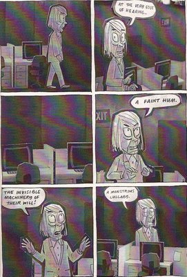
Molly Lawless’s first issue of Sleepwalker contains three stories and a couple pin-up pages.

“Great Moments in Baseball” documents a not so great baseball moment. Strangely winning their last ever home game in 1971, the Washington Senators were forced to forfeit the game after being besieged by trash and debris from the stands. Here, Lawless crams the panels full of shading and detail. It gives the ballpark a claustrophobic feel that the players probably felt as the game sputtered out of control.

In “The Turning of the Worm,” loser Jeff worms his way into a famous writer’s life. The writer, Martin, is a mess, and Jeff pays Martin’s bills and answers his mail. Jeff convinces his friends that he assumes a much greater role in creating Martin’s books. After three years the relationship between writer and assistant grows antagonistic. Jeff takes pleasure in tormenting Martin, and it looks like just a matter of time before Martin reacts. In the story, you don’t feel for either Martin or Jeff, but when part one ends you are curious about what happens next. “The Turning of the Worm” is written by Carlton King and drawn by Lawless.
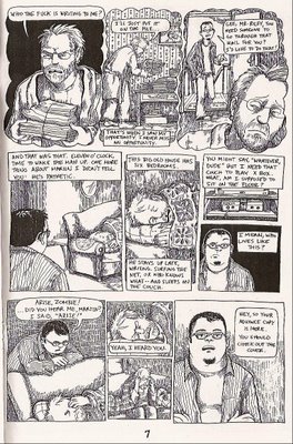
By using shading and crosshatching, Lawless adds unusual texture and depth. Her panels are rich with detail, but you never get the feeling she’s trying to hide her line. In “Turning of the Worm” especially, the extra shading gives Martin and Jeff’s world a kind of skeevy sheen.

Lawless also has a short piece about witnessing a crime and doing nothing. The art is sketchier and unpolished, giving it a breezier feel than the two other stories. One of the pin-up pages shows a barefoot Britney Spears carrying baby Sean Preston. Sean Preston is holding a bag of chips and a blank word balloon floats above his head. I filled my word balloon with, “These Cheetos ain’t ‘flaming hot,’ dammit!” I must mention that Lawless sent this mini in long ago, when a Britney and baby reference was still funny. Now it’s just sad…

Sleepwalker is a 16 page mini. You can get your hands on one by emailing Molly Lawless at mollylawless@yahoo.com. Also, she has a blog devoted to Sleepwalker. Check it out for more art samples and information.

Tuesday, December 19, 2006

The Asthma Chronicles

Also, for your viewing pleasure, a Like Story by Sommer Browning.

“Like Story” is from Browning’s blog, Asthma Chronicles. Go dig through the archives for funny stuff. Funny if you’re mean like me…

Monday, December 18, 2006

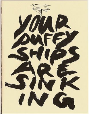
Your Puffy Ships Are Sinking by Terry Corrigan and Garrett Van Winkle

In Your Puffy Ships Are Sinking, Terry Corrigan and Garrett Van Winkle take turns drawing panels. An unnamed flying creature accosts a sleeping man, toys with him without waking him, and then leaves the man transformed. The two meet again a couple of pages later, exchange shouted words, and suddenly the flying creature, seeing someone else falling from the sky, departs.

I’ve just described most of Puffy Ships, but the three central figures stumble across more adventure. At the bottom of each page, an upside down comic traipses across the page. I read the whole thing as two distinct comics. I’m not sure that it’s correct, but this is what I did: after reading the main story, I flipped the book upside down and, starting from the last page, read the substory backwards. The substory captures the movement and rhythm of one of those flipbooks that you flip the pages quickly to emulate movement.


In Your Puffy Ships, it’s hard to discern Corrigan and Van Winkle as distinct artists. They both have a spare line that gives the work a feathery, airy quality. The pages feel light and some of the panels feel like they could float away. This is not a style that everyone loves, but I think it holds a certain charm.

No webpage that I could find to order the comic, but you can email Corrigan at puffyships@gmail.com or Garrett at how.to.draw@gmail.com

Garrett has a webpage.

Wednesday, December 13, 2006

Can't Believe I'm Linking to Newsarama

But, this is cool. I loves me some Mr. Big from Matt and Carol Dembicki.

He's been talking about a big trade, so I guess this is it. If you haven't read Mr. Big yet, you should order this.

Thursday, November 30, 2006

A Beasts Preview

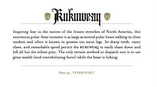
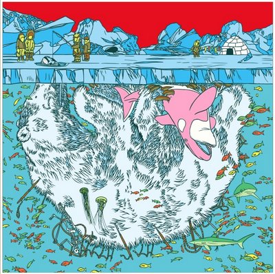
Here are three preview images from the forthcoming Beasts: A Pictorial Schedule of Traditional Hidden Creatures From the Interest of 90 Modern Artisans. Fantagraphics is releasing this beauty in January, but I couldn't resist sharing a few images here. Rege Jr. and Nilsen have been featured here before for mini-comics, so it's not entirely out of line to post these images at SIZE MATTERS. Plus it's my damn blog and I'm very excited about this book.

Beasts is a 200 page hardcover dreamed up by the talented Jacob Covey. Inside, 90 artists give their take on monsters actually thought to exist at one point. And just maybe some of these creatures do still exist... Each beast gets the full color treatment and on the facing page a short paragraph gives the details.

Tyler Stout

Ron Rege Jr.

Anders Nilsen

Tom at Comics Reporter has more images from Beasts, including Tom Gauld and Mat Brinkman.

Tuesday, November 28, 2006

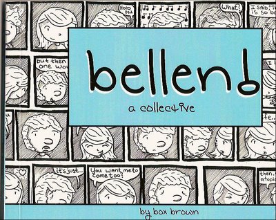
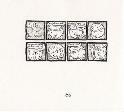
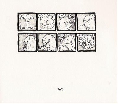
Bellen! A Collective by Box Brown In Bellen! Box Brown delivers a near overdose of Ben and Ellen relationship moments neatly packaged as tiny comic strips. Among the 71 strips, you find genuine and adorable snapshots like Ben begging Ellen to talk in her “mousy voice.” She complies, making Ben swoon until her mousy voice warbles, “Ben…You have to go move the car.”

As you would expect over 71 strips, not every one translates to the reader. In relationship comics, the cartoonist knows exactly what he or she wants to express, but it’s not always clear to the reader. The inside jokes don’t always translate. Brown does a good job here though, hitting the mark more often than not. He sticks to basic scenes of early relationship bliss, giving readers the required information.
The art is very simple. Tiny panels float in groups on a sea of white page. Inside the panels, Brown sticks to head and torso shots of Ben and Ellen, occasionally tossing in Ellen’s cat. He uses almost no background. Instead, he uses diagonal lines running parallel to fill in panels.

Bellen! records random moments in a relationship. It’s possibly too saccharine for some readers, but I found it charming. You can check out Box Brown's strips at his My Space Page and buy Bellen! here for $7. He's also on WebComics Nation.
Monday, November 20, 2006

Thanksgiving Week in Las Vegas No updates this week, folks. Vegas is calling us...

Sunday, November 12, 2006

Leslie Overnight by Damien Jay

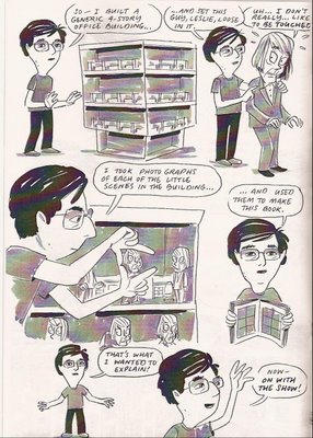
Leslie Overnight is the result of a larger project, Opolis, at the Flux Factory in Queens. A group of artists constructed individual beuildings out of paper and cardboard. Visitors walk among the buildings, peering into the windows to follow the story within.
Above you can see the structure of the building. In the comic, different versions of Leslie creep around the building. To make the comic, Jay photographed each scene and assembled them in order. In this story, Leslie is a bit of a kook. At one point, he even breaks out the tin foil hat.

Jay doesn’t simply make a static image of Leslie and move him around; there must be dozens of cutout Leslie figures to fit in with different scenes. If you sit down and really look at this comic, you realize just how much work he has done to pull this off. Jay has drawn and cut out dozens of Leslies, multiples of the security guard character, and the various word balloons. He then had to place the cutouts correctly for each panel before taking a photo of each. Multiply this by 30 pages.

The finished product is much richer than it sounds. The cardboard scenery kind of adds to the realism, as weird as that sounds. The props have more fullness than something merely drawn. As Leslie floats through each panel, the office desks, cubicle walls, and other details create a stage prop feeling.

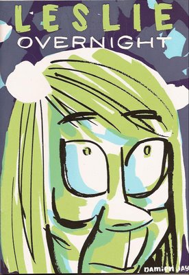
The cover of Leslie Overnight is striking. First, it’s larger than your standard mini-comic, but second the close up image of Leslie’s face is unforgettable and a little disturbing. Jay did a fantastic job on the screen printing as well.

I don’t see a price on this, but according to Jay’s website it’s $4. You can read the comic on his website, but take it from me; this is a nice one to hold in your hands. Leslie Overnight is unique and charming. It reminds me why I love mini-comics.

Wednesday, November 08, 2006

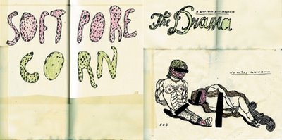
The Drama #9

Mini-comic and art fans everywhere, keep your eyes peeled for the latest issue of The Drama. In my humble opinion, the ninth issue is the best yet. There’s a photo-packed feature on the “Wunderground: Providence: 1995 to the Present” exhibit and a high energy (you just have to read the damn thing) interview by Dan Nadel with Brian Chippendale.

Of course, you’ll also find the comic section in the back featuring Leif Parsons, Tom Kaczynski, Sabine Allaire, Peter Thompson, Matthew Thurber, Vanessa Davis, Zak Sally, David Abbott, Bendik Kaltenborn, Laura Park, Max Hubenthal, Nicolas Robel, Christopher Norris, Marc Bell, Mark Burrier, Mike Ball, Derek M. Ballard, Lori D., Alex Lukas, & Travis Robertson. That’s pretty darn exciting.
If you can’t find it at your local newsstand or bookstore, you can grab a copy from the Drama store online.

I reviewed mini-comics from Grant Reynolds and J.P. Coover for this issue, so you know it’s fantastic.

PS- Congrats to America today. The Republicans have lost a good measure of control and Rumsfeld has stepped down. Yay us!
Thursday, November 02, 2006

Mini-Comic Contest over at Dave Ex Machina

Win a signed copy of Teaching Baby Paranoia by Bryant Paul Johnson over at interet pal Dave's website.
What are you waiting for? Go pay Dave a visit and enter his contest.

Wednesday, November 01, 2006

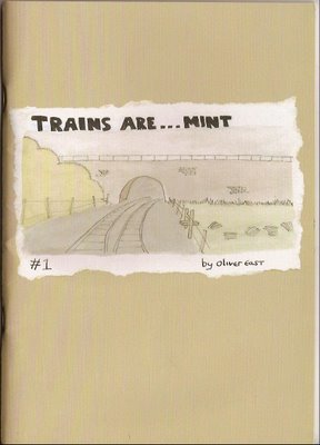
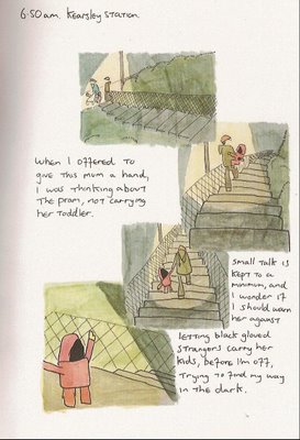
Trains Are Mint by Oliver East
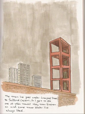
In Trains Are Mint, Oliver East takes readers on a lovely tour of Manchester train stations. Starting at the Oxford Road Station, he highlights the things that strike him along the way. East is on a journey with no goals save understanding and a pint at the end of the track.
The real beauty of this mini-comic is in the watercolor or paint wash art. His tour is intimate and real, but the art is fantastic. East uses simple shapes and unique angles to suggest innocence, even when he’s looking at a dodgy alleyway. His cars are the cars that we learned to draw as children. There’s a bit of Allison Cole in his art.

Trains Are Mint is a great example of what mini-comics do so well. East takes something important or interesting to him, and puts it on the page for a small audience to discover. What I like about East’s effort is the extra touches. The watercolor art is gorgeous. He uses a neutral, stiff card stock for the cover with plenty of information for the reader inside the back cover. He doesn’t list a price, but you’ll find a website and a MySpace page that tells you everything you need to know.

And if that’s not enough, he has page samples! Nice job, Oliver. Give him a shout. Order your own copy of Trains Are Mint. Looks like he’s only made 500 copies of this first issue.

Tuesday, October 24, 2006

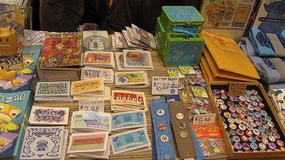
My Favorite SPX Report Look at all those mini-comics!

More pretty pictures and captions from J. Chris Campbell.

Fun stuff!

Friday, October 13, 2006

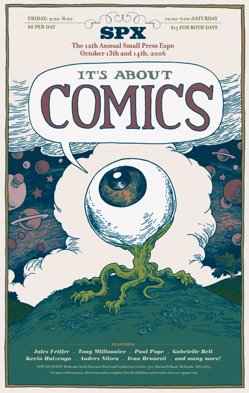
SPX Weekend is upon us!

Here's a short article from the Washington Post.

And here's a column I wrote this week about SPX and mini-comics over at Comic World News.

To everyone going - enjoy the show!

To those of you that can't go, maybe you can make it to the Gary Panter and Art Chandry exhibit in St. Louis. I'll be checking that out soon.

Wednesday, October 11, 2006

Fiji Island Mermaid Press Artist's Book of the Month
Club
by Marc Snyder
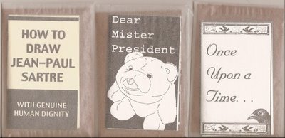
Okay, these are pretty cool. Marc Snyder sent in ten little art book/mini-comics for review. Each book is a piece of paper slightly smaller than letter size. Snyder folds them up to create little 8-page (including front and back cover) booklets. Inside, he uses drawing, painting, photos, rubber stamps, and font to craft a mixed media book. The books themselves are Xeroxed copies of the originals.

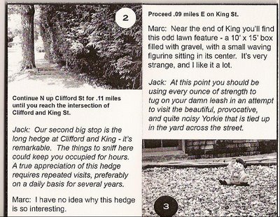
Of the ten books, a few stand out right away. Great Dog Walks in Hamden Connecticut!, as told by Snyder and his dog Jack, is one of them. A map on the inside cover outlines the walk with each point highlighted. Then Snyder and Jack give the highlights of each walk in their own point sof view. Obviously, dog and man see things quite differently.
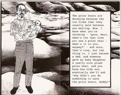
Several of Snyder’s books are critical of the current administration’s inability to do anything that doesn’t turn out to be a complete clusterfuck. The best are Dear Mr. President, where Snyder outlines his concerns over the shrinking habitat for polar bears due to global warming, and The Right Answers, which displays some nice linocut art that’s very reminiscent of Seth Tobocman’s work.

In Once Upon a Time, Snyder laments the extinct passenger pigeon. Through mostly text, with rubber stamp images on each page, Snyder tells of flocks of passenger pigeons that once blotted out the sky.

How to Explain Joseph Beuys’ “How to Explain Pictures to a Dead Hare” to a Dog is a cheeky look at attempting to communicate Beuys to Jack the dog. I don’t think Jack gets it.

As a member of the Fiji Island Mermaid Press Artist's Book of the Month Club you get one new book each month for $25 (postage included).

Friday, September 29, 2006

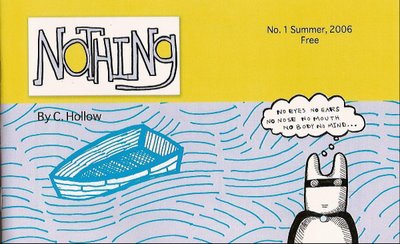
Nothing by C. Hollow It’s so rare to get something tangible for free these days, but if you go to C. Hollow’s website, you can get a copy of Nothing #1 for free.

Nothing #1 is a tight issue where Captain Hollow searches his own feelings for what life and death mean to him. If you assume Captain Hollow is C. Hollow and the Sweet Nothing is his wife, then this is an open and shut case of “What does life mean to me?” And there’s absolutely nothing wrong with that.

In fact, Nothing is about something. It’s about the relationships we have with our mothers, our fathers, our significant others, and even the relationship we have with ourselves.

The characters are crudely drawn, but whole. The backgrounds are chunky, but serviceable. In short, Hollow uses basic structures to communicate to the reader what may be going on at any time. It’s kind of rudimentary, but effective in it’s own way. A few quick observations about the comic: Captain Hollow and the Sweet Nothing both have these little swirls for eyes. There are no hints beyond words as to what’s happening inside. The hand-lettered font has this odd habit of highlighting certain letters. It’s kind of distracting at first, but not as distracting as the weird random bold words you find in Marvel comics.
What I like about Nothing is that you have this guy making comics and putting “Issue No. 1 Summer, 2006 Free” on the cover. He’s giving his comics away. AND issue number two is the same price. It’s free. Go to his website and almost every day there’s a new one panel comic. Here’s someone honing their craft and doing everything he can to get his work into your hands. Do us both a favor and go check out Nothing. Maybe he starts charging for the next issue, I don’t know. But if you hurry, it still says “Free.”

There are samples of both issues at Hollow's website. Issue #1 is 29 pages with a color cover.

Wednesday, September 27, 2006

Rocket Science Anthology by Various Artists
Eight artists contributed to this anthology comic. The common thread holding each story together is that each artist has to begin with the last image featured in the previous artist’s story.

The first story begins with a musical note and ends with a hacksaw. The second story then begins with the hacksaw and ends with a coat hanger. The third story begins with the coat hanger… You get the picture.

A few of the artists have more than one story in the anthology. I think Ralph Kidson’s work stood out the most. It seemed rushed, but highly energetic. It’s a little difficult to tag each artist’s work by using the key on the inside back cover, but I think I have most of them figured out. This is Kidson’s birds arguing right before something terrible happens.
Richard Cowdry takes a new look at a Popeye type character. The raucous sailor gets his bar mates drunk and introduces one sodden soul to his, ahem… Bluto. Rocket Science is labeled as an “adult anthology.”

Tilly Aviram has a very brief two-page alien tale using a simple style that skips backgrounds and details, but delivers maximum story.

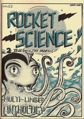
As anthologies go, this one is about average. It’s nothing earthshaking, but nothing bores you to tears either. Rocket Science is nicely packaged with an excellent cover that manages to evoke old sci-fi monster comics on the front, and feature a short doodle by each artist on the back. Gavin Burrows, Richard Cowdry, Ralph Kidson, Sam Chivers, Craig Burston, Toby Parsons, Tilly Aviram, and Peter Poole contributed to this comic.
Rocket Science is 40-pages and available by emailing Gavin Burrows at Gavin.C.Burrows@aexp.com. It’s listed at 2 pounds, so that’s like $3 American. Email Gavin (Mr. All Flee) to get some details.

Also ask him about the intriguing pub-fueled follow up possibly titled Piss-up in a Brewery.

Saturday, September 23, 2006

Wunderground exhibit in Providence, RI

If you live anywhere near Providence, RI you would be crazy not to attend the ”Wunderground” show at the Rhode Island School of Design. I stumbled across this over at the Comics Comics blog. The show features posters, as well as some larger pieces of art and sculpture, from 1995 to the present. The artists should be familiar to mini-comics fans: Mat Brinkman, Brian Chippendale, Jim Drain, and Leif Goldberg.

Go check out Dan Nadel’s short report with pictures.

I mean come on, Mat Brinkman’s 20-foot tall ogre (“Maximum Ogredrive”) made from paper mache…

Thursday, September 21, 2006

This is Still America by George

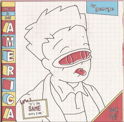
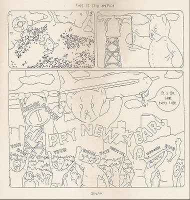
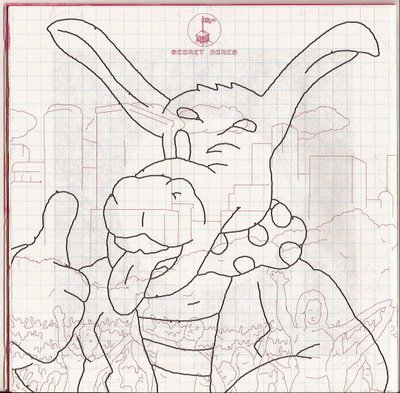
This is Still America: “It’s the same Every Time” has one of the most interesting covers I’ve seen lately. George (no last name given) takes thin graph paper and draws a boy’s huge head front and center. Down the left spine the title of the mini really draws your attention with effective use of color and shape. It’s quite striking. The more subdued back cover is almost as arresting. He uses red lines that remind you of something you would get from an Etch a Sketch to create a background for the main image. I hope this comes through in the scan that I’ve made.
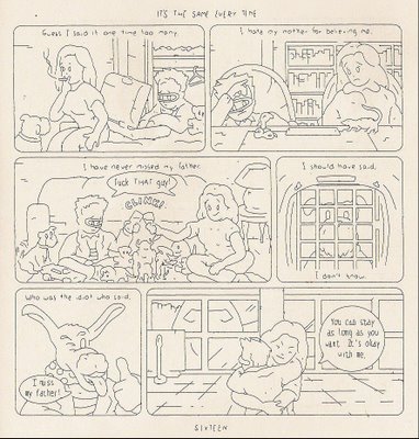
Inside, George does something very odd with his line work. Figures are fully outlined, but delineating features fade in and out, or don’t exist at all. Background lines are half formed. It’s as if he’s made the full drawing and then went back and erased bits and pieces. It makes the reader fill in the blanks, but really requires very minimal effort. In fact it lends a dreamy quality to the whole story. You’re not sure if you’re in the past or present without the story cues.
The story fades in and out from recollections, dreams, and memories. The protagonist dreams of events from his childhood, but the weird dream details bleed through. That’s when you get this image of a giant teddy bear grasping a jumbo jet. The kid is a passenger in the jet.
This is a nice package for a mini-comic. I like the red bleeding edges to the pages and the overall look and feel. Even Kate commented that it looked cool. This is Still America is 22-pages for $2. Email the artist at george@secretacres.com to request a copy.

Monday, September 18, 2006

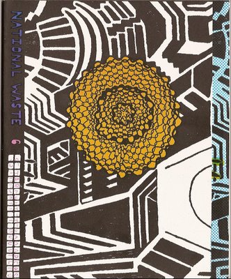
National Waste #6 by Leif Goldberg
Leif Goldberg’s awkward and angular images may be a turn off for some readers, but there’s something underneath that works. When you look at his art you'll notice similarities to Christopher Forgues (CF from the Kramers Ergot books). Goldberg's National Waste drawings remind me a bit of a friend’s elaborate study hall drawings in high school. This connection isn't a suggestion that his work is amateurish; instead it’s full of passion and unconcerned with traditional drawing rules and regulations.

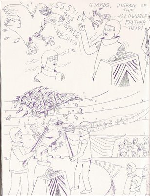
Goldberg ignores laws of physics or behavior and the result is engrossing. The flat lines of an ink pen come alive as a strange bird crashes through a ceiling.

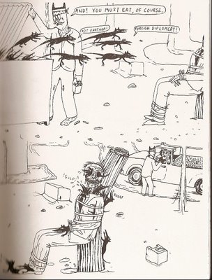
Later a bevy of vicious looking rat-like creatures devour a corrupt diplomat from the inside out – they start with his eyes.

Goldberg’s work is politically charged, but not preachy. The destruction of the environment is a familiar subject in his comics, which feature technicolor animals traipsing through damaged forests.

The sixth issue of National Waste is 3 separate stories interspersed with vivid color pages. The last story is especially well crafted as a wandering pilgrim steps from the familiar into uncharted territory. It’s a nice way to end the book, as it reflects how Goldberg’s comics sometimes make you feel. You know exactly where you are when you pick the comic up, but afterwards you’re somewhere else entirely.

Grab your copy of National Waste # 6 from the Bodega online shop or Quimby’s.

Thursday, September 14, 2006

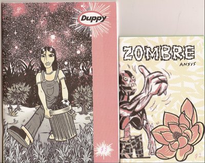
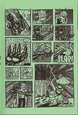
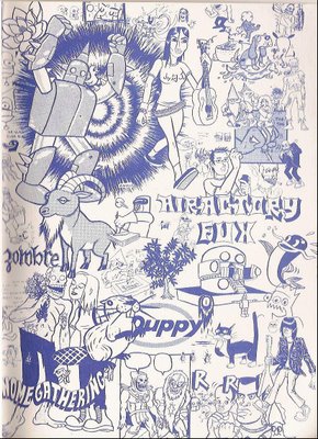
Zombre vs. Slappy: Megathunder Showdown and Duppy by Ansis Purins Occasionally, I’ll open up a mini-comic and it immediately clicks. Either it’s the format, the materials, the art, or the total package, but something just gets you. Ansis Purins’ minis are like that. Take Zombre vs. Slappy: Megathunder Showdown, for instance; Purins doesn’t use any words beyond “HAR,” “HAA,” and one “HOLY SHIT,” but through gestures, movement, and grimaces, he effectively telegraphs his story.

Zombre vs. Slappy is 12 pages of zombie slapstick printed on green paper stock. The cover is gorgeous as Zombre, or maybe Slappy, gives the reader a grin and a huge thumbs up against a throbbing background. Inside, Purins entertains you with exaggerated movements and a thick-lined style. His art is perfect for this offbeat comedy. Everything on the page stands out, especially the little details like puddles or blades of grass. It’s like he’s chosen to take what works in cartooning, but added a much thicker line. Occasionaly, the scenes feel somewhat crowded or claustrophobic, I think mostly due to the shading and raindrops.

Zombre vs. Slappy: Megathunder Showdown is available on Purins’ website store for $2. If you read only one Zombie comic this month, burn all the others and read something cool like this instead.

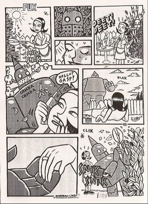
Or read Duppy, but quit reading all that awful derivative crap and enjoy something unique. Duppy is a more substantial mini than Zombre vs. Slappy. While the later was more visual and intense, Duppy opens up a bit, allowing the art to breathe on the page.

Duppy is a larger format and page count (36 pages), and Purins adds more variety this time out. I like the brave housewife vs. zombie and the startled housewife vs. love struck robot. He also, just for kicks, throws in a zombie vs. bobcat battle for good measure. Purins has a nice handle on visual storytelling in this one; the first story alone is almost worth the $3 price tag.

Duppy is available on Purins’ website too, but you can also grab his books at the following online venues: youreinsanehoney.com, Midtown Comic.com, GLOBAL HOBO, Poopsheet Shop, and Arcade Distro.

His next comic, out soon, is called GNOME GATHERING. Purins says it's "A 10 page story about 3 cosmic hippie underlings (ie:dwarf,elf,hobbit) that do waaay to many drugs. They talk about classic rock albums and smoke tons of weed. Their life is pretty good until the Wizard assigns them to do work for the national park that they all live in. Kinda weird I know. Zombre,SLAPPY, and the Park ranger from the ZOMBRE mini are in it."

The core story of Gnome Gathering will be in ELF WORLD #1 from the lovely folks at Family Style.

Finally, I leave you with the inside back cover of Duppy. Enjoy.

Monday, September 11, 2006

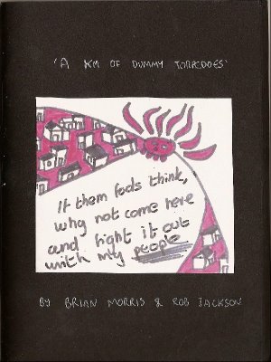
A Km of Dummy Torpedoes by Rob Jackson and Brian Morris

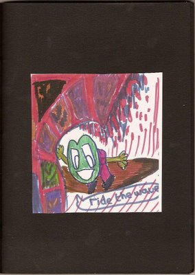
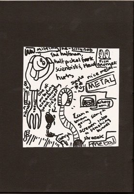
Rob Jackson and Brian Morris’ art book is a loosely connected one of a kind series of drawings assembled in a different order for each book. In this way, each book is an original. Not all drawings appear in each book, meaning mine might be totally different from yours. Some of the pages are very clever, while others funny. A few drawings are simply there, but when viewed together they make a neat statement.

Roughly a third of the drawings are in color, colored with what looks like magic markers. The other drawings are simple black and white. The book consists of black construction paper with the drawings themselves cut out and pasted onto each page. This makes the book a very hefty 28 pages.

You can find samples at Jackson’s website. Get your own copy by emailing Rob at the website.

Thursday, September 07, 2006

Return to Regularly Scheduled Program

Sorry for the huge delay in posting. Adjusting to a new job and then moving really put a dent in my comics related activities. The good news is that the new job is fantastic, and I've figured out how to better manage my time. Other good news is that Kate and I are officially moved in to our new condo downtown. Between cleaning the old place, packing, painting the new place, moving, and then assembling IKEA furniture every night until 1am, we had no time left for anything else.

It's worth it though and kind of weird, because Kate and I both feel like we're now officially married. This is our first home purchase after renting for too many years, and it just feels so right. Our place is in the Mass. Ave Art District, so we're surrounded by art galleries and cool restaurants and bars. We finally feel like we fit in our neighborhood. I still hate all of you that can afford to live on the coast, but this amazing new space makes up for it a little bit.
I've assembled a stack of mini-comics that are waiting to be reviewed. If you're out there waiting for a review, I double dog swear I will get to it soon. My address for reviews has obviously changed. A few people already have the new address, but if you don't and you need to send something, email me at shawnhoke@gmail.com.

Friday, July 21, 2006

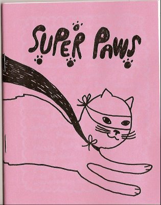
Super Paws by Missy Kulik
Cats have a rich comics legacy. Sure you’ll find a lot of dogs in comics, but cats are king. You can do so much with the character of a cat. They’re mysterious, malleable, a little neurotic, and damn cute.

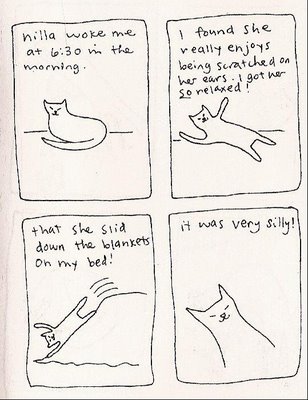
With Super Paws, Missy Kulik adds to that tradition in a John Porcellino style. Her Nilla is drawn a lot like Porcellino’s Masie, while Kulik’s art feels a lot like King Cat. Her prose is breezier – more cheerful. In this 16-page Super Paws mini-comic, she introduces us to Nilla, who she found at the local shelter.

Kulik bounces from little slice of life observations centered around Nilla, to the story of finding her at the shelter, and finally to the fantastic, as Nilla assumes her “Super Paws” identity. This is one example of what I like about mini-comics. It’s personal. It means something to the artist and connects me the reader with her through the art and the subject. The last page has a picture of Nilla enjoying her “birthday cake” celebrating her adoption from the shelter. That’s pretty cool, considering the alternative to adoption that shelter animals face.

Three cheers for Super Paws!