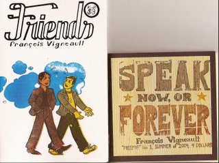
 Issue one of Friends has a wonderful, organic feel to it when you hold it in your hands. The thick, brown cover has a thin layer of wood pasted to the front, and it’s on this wood that the title, “Speak Now or Forever,” is stamped in the style of an old wanted poster. This is one of the most interesting mini-comic covers I’ve seen in some time. Inside, the pages are a light butter color usually split into four equal sized panels. Vigneault’s art is warm and I enjoy the way he draws his faces. Sometimes your initial reaction to a comic can color the way you judge it, and this may be one of those times.
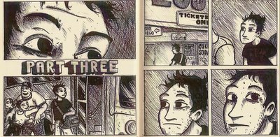
 Whether he purposefully left earlier faint pencil lines in some panels or not, they are often quite noticeable. This is especially noticeable when you look at the lettering; the ruled lines are often visible as though they weren’t fully erased. I wasn’t bothered by this at all, which is strange because I’ve probably complained about that on another mini-comic before. In this first issue of Friends, the faint pencil lines are almost like seeing through the skin of the story. It’s like you can see the bones, muscles and ligaments, and it adds to the organic nature of the book. The art feels rich and fully realized, but strangely the level of detail isn’t high. The panels feel textured rather than inked, if that makes any sense.

The story is a simple one, Chris is traveling on a bus and he spies an attractive blonde girl. She’s the one thing on the bus that stands out (Vigneault does a nice scene where hers is the only night light on in the bus as it hurtles across the darkened interstate). During one food stop, they share a table together and chat. Their conversation captures that easy-going feeling that you get when you find someone with your own sensibilities in a busload of strangers. There are three parts to this mini-comic and the middle section is six pages of prose with small illustrations. It’s a pleasant touch that I wouldn’t mind seeing more of in comics sometimes. Yes, it’s a short cut or you could say it’s taking the easy way out, but it really helps flesh out what a character may be thinking or doing at a particular time.
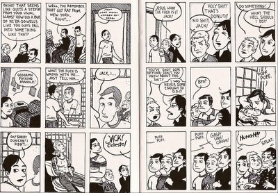
Issue two of Friends is a different beast. It’s taller dimensions wise and the cover is a bright white with a silk-screened image in three colors. Inside the pages are a bright white with nine panels per page. The art is sharper than issue one, but the backgrounds are less fully realized. The art in the main story, about two friends both named Jack taking off to Vegas to join a band of card counters, just doesn’t feel as warm as the art in issue one. Often several panels in a row are just talking heads against a white background. Vigneault does a nice job mixing up the panels, but this one feels a bit flat next to the first comic. By itself, it works. Compared to the first issue, it falls a bit short visually.

The backup story, actually more of a sketchbook story, is about girls that he has developed crushes on. This section feels a bit warmer, although it’s rougher art wise than the main story. As a sketchbook, it feels more human. Or in other words, you can see a human hand at work.
Issue one of Friends is 32 pages for $4. Issue two is 24 pages, but almost twice as tall as issue one. This one will run you $3.
You can visit Family Style.com for a peek at Vigneault’s comics, including 13 pages of his sketchbook crush comics. You can purchase mini-comics using PayPal in the Family Style store.


No comments:
Post a Comment