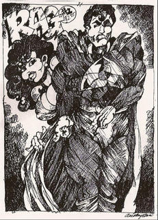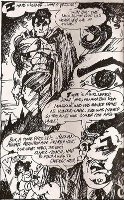
I had some problems with Rag. I don’t really like homemade comics that use super heroes, and I had some trouble understanding everything that was happening. Still, Acri’s comic has an interesting visual structure. And the back cover has this little tidbit:
”See, when I was a kid, Batman was a gay dandy, and we went with that! Remember when Jews and Italians made great comix about bosomy women in spaceships? Remember C.C. Beck and Don Martin? “
So, I flipped open Rag and got to work. Acri does some neat tricks with close-ups, but it’s hard to appreciate it because of all the lines everywhere. Several times, it wasn’t immediately obvious what I was looking at until I kind of distanced myself from the page and let my eyes cross a bit. Then I could tell, “Oh, it’s a close-up of Mr. Duvall’s face.” That works! But again, there are too many lines obscuring what could be a clever panel structure. You see this a lot in comics - artists who may not be confident with the way their art looks try to cover it up with more details and lines. It doesn’t work; the page just looks cluttered. You can’t hide bad art. The thing here is that Acri isn’t necessarily a bad artist. It’s just difficult to see the art. When you can see it, it’s not bad.

This is mini-comics so I hate to get really critical; it feels kind of like I’m stepping on a kitten. Especially when it’s someone like Acri who wrote such a nice note and obviously has a great passion for his work. So let’s try to help here. Rag could be a much better comic. As it is now, it’s difficult to read, literally. The lettering sometimes borders on scribble and I had difficulty reading it several times. The reader shouldn’t have to work so hard to decipher handwriting. Strangely, the lettering is much more legible in the beginning pages, but often unreadable on later pages. I almost pictured a frenzied Acri at the drawing table pumping out page after page.
The story in Rag is fun. I think it’s one that many of us who harbor a fondness for the comics of our childhood could enjoy. But there should be more care and time spent on making the comic friendly to readers if you want to put a price tag on the cover and sell your mini to someone else. The panel structure is the strength of the book, and the general story is okay, but the lettering and shading need to be tidied up. I mentioned the lines earlier, and shading is okay, but you can’t let it overwhelm the art.
I’ve seen much worse comics land on my doorstep from comic publishers. Seriously. Mini-comics though is a one man or woman show. It’s all you and you can make the changes, or ignore them. It’s your comic. Rag has the basics down, but it could be a better, more reader-friendly comic. Issue one is eighteen pages and sells for $2.75. Contact Anthony Acri at antonius825@hotmail.com for more information.


No comments:
Post a Comment