Hmm, the comic anthology. It’s certainly a dicey proposition for both creators and readers. It’s rare that you’ll like everything in any anthology that you read, but I’ve found it’s even rarer when it comes to mini-comics anthologies. The folks at Ferret Press sent a few issues of their elegantly packaged anthology Panel, and the issue I picked up today to review is a mixed bag.

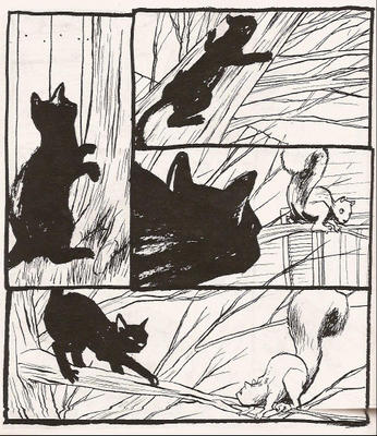
The Fall 2004 issue of Panel is titled Home. Each story addresses the concept of home in a different way to different degrees of success. “Inside/Out,” Andy Bennett’s wordless tale of a cat that gets stuck outside and how it gets back in, worked well as an opener for this anthology. The black cat’s features are just blurred enough for this cat to be “any cat” as opposed to “this cat.” The less detailed features of the cat make this a more universal story and I enjoyed the way the cat reacted to its environment. The cat’s idea of home is firmly centered inside (on the back of the couch to be exact) and he/she begins and ends the story in the same position.

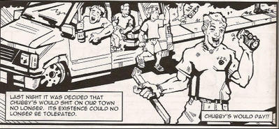
The art in Tim McClurg’s “Chubby” doesn’t work for me. He uses a mixture of very thick and thin lines to create his characters and backgrounds, and sometimes this makes the art look too “chunky.” He may be trying to add variety to his line, but it’s too jarring in this story. It’s a decent anecdote of small town hijinx though and the art might not bother you as much as it bothered me.

“Pilgrim” by Matt Kish is a short wordless tale about an astronaut that gets disconnected from his lifeline in space. It’s short, effective and it stays with you after reading it. This one is visually pleasing as the panels are divided by the inky blackness of space and the bright white of the astronaut’s space suit.
“Buried Talents” by Craig Bogart would make a good short story. As it is now, it’s merely okay as a comic. The computer font lettering pulls me out of the story, which is a shame because the narrative is extremely personal. However, the font makes it feel less personal and kind of rushed. The art is serviceable, but it doesn’t do quite enough for me to remedy the problem that I had with the font lettering. The story is solid, if a bit melodramatic at times, but this could be a much better comic with a few minor changes.
“Xiang/Home” by Sean McGurr (words) and Dan Barlow (art) is a very charming little tale of a nine-month old girl adopted from China. It’s told from the perspective of the adopting father and his concerns make me think that he will make a wonderful parent for this girl. Unfortunately, this story has the same problem as “Buried Talents” – the computer lettering font. In both stories, the font actually works against the story. This might just be a personal preference but I like hand lettering in mini-comics. It feels more natural for the format. I have horrible handwriting, so I succumbed once and made a mini with computer lettering. My wife liked it better, but it just felt fake to me. Now, I’ve retreated back into the very messy and tedious world of my own crappy hand lettering. It works better with the amateurish art anyway.
Back to Panel: Home; the last story in this anthology, “Cribs” by Tom Williams is a little scattered. It’s a play on the MTV show, but instead of visiting musicians they visit Tom Williams the cartoonist. Let me say up front I loved the ending to this story and Williams draws some adorable doe-eyed squirrels. But – you knew there would be a but – it seems a little too madcap. There’s a roommate who spends all day shooting squirrels off of an electric line, Sebastian Bach hiding behind a Tawny Kitaen poster, and an excitable monkey that colors with oranges. Tom’s art is actually very fluid. His character has a great comic face with shining black eyes and an expressive mouth. Reading this you get the sense that Tom’s home must be very hectic.
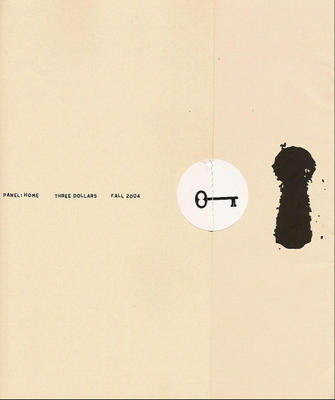
So there you go, six stories by seven different creators. I ended up liking half of them and then quibbling over things like lettering and lines that are too thick. Panel: Home is a forty page three dollar book and it has excellent production qualities. The thick creamy yellow cover folds over from the back cover that’s about three inches longer than the front cover. There’s a round white sticker with an old fashioned skeleton key to hold the back flap over the front. To the right of the key sticker is a enlarged keyhole opening. Inside the front cover is an index, but it’s in the form of an apartment buzzer with name plates underneath to show the names of the stories and the creators. It’s a pretty snazzy package.
You can check out the perviews of each story at the Ferret Press Books section.


No comments:
Post a Comment