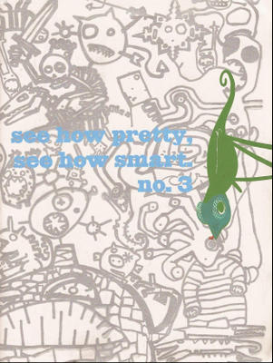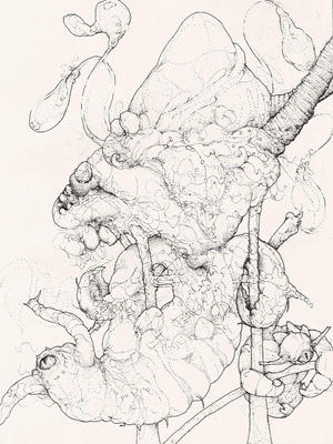
Sean McCarthy’s See How Pretty, See How Smart is not only the perfect showcase for his own work, it’s an opportunity for other Partyka members and allies to do pieces shorter than their own projects. Each section of these books takes up only two to six pages and the shorter format/shared environment seems to allow for greater risk taking. The physical size of this book is much larger than a typical mini-comic and it needs to be, especially considering the space that McCarthy’s images need to slowly writhe and creep their way into your brain.

Sean’s work is equal parts beauty and horror. He mixes bold lines and stippled patterns of pencil and ink to create a monstrous orgy of animals and beasts devouring, fighting, fucking, and evolving. Lost within the body of beasts are swirling pencil point patterns that meander and converge into recognizable figures. A quick glance gives you a simple impression of intertwining creatures, but a closer inspection reveals an amalgamation of bodies, organs and limbs. In issue four of See How Pretty, See How Smart, Sean gives you a peek behind his work in the form of rough sketches that are as fascinating as the finished product.
Sections by several other creators fill out each issue of See How Pretty, See How Smart. Issue three has work from Sean McCarthy, Andy Bodor, Zak Smith, Craig Taylor, Jeffrey Lewis, Shawn Cheng, Theo Rosenblum, and Matt Wiegle.
The cover to issue three by Sara Edward Corbett and Zak Smith is endlessly fascinating and the inside of both front and back covers feature John Mejias designs. Inside issue three things begin with Andy Bodor’s “Bunny and Ghoul.” Bunny and Ghoul stayed up too late watching “dancing dawgs,” and then they arrive at the radio station just in time for an on-air appearance. I’m not sure why they’re applying make-up for a radio gig, but things don’t go very well for Bunny and Ghoul. Bodor has a pleasant chunky style of drawing that uses rounded, stocky figures and ink wash backgrounds. Occasionally, he uses type font in addition to lettering, but it’s usually to drive home a point or to indicate the voice of someone other than the two main characters. The story is absurd, but kind of charming. The first panel is a close-up of the bunny and the ghoul sleeping in bed. The bunny has his mouth wide open as if he’s snoring and the ghoul has drool dripping from his mouth.
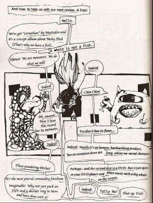
After five full page drawings from Sean McCarthy, Zak Smith has a bit called “Monsters Review Records” with two martini slurping monsters, uh, reviewing records in the voice of “distinguished gentlemen.” Here’s a page for your enjoyment.

Craig Taylor also provides seven pages of fairly abstract work titled “Marginalia of an Aesthete.” I would have liked to see these in color rather than black and white. The forms and shapes are interesting, but having only black and gray minimizes the effect of the images a bit. Taylor has an absolutely startling image to begin his section of issue four, which I found more remarkable than his work in issue three. Taylor also provides the striking cover to issue four.
Jeffrey Lewis has a four-page low brow Canterbury Tales strip titled “The Canterburied Tales” in issue three. Each character tells their story and each one is more far out than the previous tale. I’ll give you four words to describe this story: zombies, necrophilia, and Einstein’s brain. Lewis’ section most closely resembles a traditional comic format, but it’s EC Comics meets Robert Crumb.
Next, Shawn Cheng fills four pages with drawings of “100 Boys.” Each boy is actually a young monster and one of them looks like the guy in Vengeance at Cackling Mountain.
Theo Rosenblum provides a creepy “The Birth of Death” story that tracks death from an asteroid, a graveyard, a reanimated alligator and then finally into a regurgitated dog’s body. Initially I was turned off by the unfinished pencil shading in used in this strip; it gave the story an almost unfinished look. But the playfulness that Rosenblum uses with the art in his section overcame my hesitation. Rosenblum’s version of death snakes though panel borders in this silent tale and there’s a delicious glimpse on the second page of the story of what lies below the buried caskets in the cemetery. There’s a cavern with pipes and attached machinery, as well as a beast holding onto a burning torch that lights up the cavern. Theo, where's the mini-comic featuring this cavern, already?
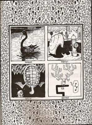
Matt Wiegle closes the book with two pages of made up creatures. I’m charmed by anything that Matt puts down on paper, so these were a perfect way to end this issue. Here are four of his creatures for you to enjoy.

See How Pretty, See How Smart is about monsters. It’s about the slightly surreal. It’s a way for Sean McCarthy and friends to stretch their imagination and art in a collaborative environment. It may not be for everyone, but it works very well for the brave or the foolish. Here’s the preview link where you can check out several more samples of art from issue three featuring Andy Bodor, Sean McCarthy, Zak Smith, Jeffrey Lewis, and Craig Taylor.
I’ve got a few more mini-comics to review from Partyka, but they will be spaced out a bit over the next month or so. I really hope you’ve found something that you like between the four books that I’ve reviewed so far. Again, check out the Partyka online catalogue for some online samples of their work.
Again, I’m sorry for the delays in posting this week. Everything is back in order at the Size Matters office and there is a large stack of minis just waiting to be discovered.


No comments:
Post a Comment